The E-Commerce Messaging Landscape
We analyzed 209 e-commerce homepages and scored them across five dimensions: messaging clarity, CTA effectiveness, ICP targeting, first impression, and pricing page quality. The median overall score is 61 out of 100 , 2 points above the all-industry median of 59.
The industry's strongest area is First Impression (median 40 vs 28 overall). Its biggest gap is Clarity (median 34 vs 36 overall). This means clarity is a common blind spot in e-commerce, and an opportunity to differentiate.
What Top E-Commerce Sites Do Differently
The top-scoring e-commerce homepages share several patterns. Here's what stands out:
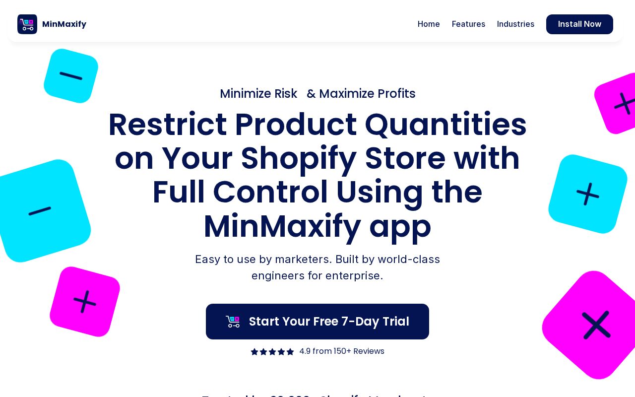
“Restrict Product Quantities on Your Shopify Store with Full Control Using the MinMaxify app”
“Run Your Ecommerce Business Better with Hextom Products”
“Free Web Stats & Tools”
“Maximize your profits with our easy-to-use apps”
Hero Text: What Works in E-Commerce
The average e-commerce hero text is 3 words long. The median clarity score is 34 (below the all-industry median of 36).
Here are the highest-clarity hero texts in e-commerce:
“Tires, Wheels, Reviews, and More.We’ll help you get there.”
“Speed Post Tracking for India Post”
“Run Your Ecommerce Business Better with Hextom Products”
“Submit Your Link and Promote Your Website”
“Restrict Product Quantities on Your Shopify Store with Full Control Using the MinMaxify app”
Notice how the best hero texts name a specific action or outcome rather than using abstract language like “empower” or “transform.” Visitors should know what the product does within 3 seconds of landing.
CTAs in E-Commerce
The average e-commerce site has 11.2 CTAs on the homepage. 46% trigger decision paralysis. That is enough competing buttons to freeze visitors.
The highest-scoring CTA examples:
The best CTAs use value-oriented language (“Start free trial,” “See your results”) rather than generic text (“Learn more,” “Submit”). They promise an outcome or lower the barrier.
Audience Targeting in E-Commerce
8% of e-commerce sites have crystal-clear audience targeting. But 0% are vague or missing audience signals entirely. They don't say who the product is for.
64% use a “for [specific audience]” pattern. This is one of the simplest, highest-impact improvements: adding “for [role] at [company type]” to your hero or subhead immediately sharpens positioning.
“For X” patterns from top sites:
“for enterprise”
“for Shopify Marketing WhatsApp”
“for on your website”
“for bulk buyers”
How E-Commerce Companies Position Themselves
Every homepage tells a positioning story. Here's how e-commerce sites break down across positioning archetypes:
The dominant archetype is Price / Value (52% of sites). If that's your positioning too, you're competing on the same narrative as 107 other sites. Differentiation has to come from execution. Less crowded archetypes like Speed / Simplicity (0%) may offer positioning white space.
Pricing Pages
48% of e-commerce sites have a detectable pricing page. 40% offer a free tier.
The industry median pricing score is 0. The best pricing pages include visible prices, 2–4 clearly differentiated tiers, a comparison table, FAQ section, and social proof.
Key Takeaways
- 1Clarity is the biggest gap. At a median of 34 (vs 36 overall), it's where most e-commerce sites lose points. Fix this first.
- 2Hero text should name what the product does. The highest-clarity sites use specific action verbs, not metaphors. 3 words is the industry average. Aim for under 15.
- 3Say who it's for. Only 64% use a "for [X]" pattern. Adding one is the fastest positioning win available.
- 4Keep CTAs focused. 46% of sites trigger decision paralysis. One primary CTA above the fold, with value-oriented language.
- 5Pick a less crowded archetype. 52% of sites position as Price / Value. Standing out requires either flawless execution or a different angle.
E-Commerce Leaderboards
Other Industry Guides
See where your site ranks in E-Commerce
Get your score across all five dimensions in seconds.
Grade Your HomepageWant a team to help fix this?
Work with us