The Edtech Messaging Landscape
We analyzed 257 edtech homepages and scored them across five dimensions: messaging clarity, CTA effectiveness, ICP targeting, first impression, and pricing page quality. The median overall score is 63 out of 100 , 4 points above the all-industry median of 59.
The industry's strongest area is ICP Targeting (median 51 vs 35 overall). Its biggest gap is CTA Effectiveness (median 57 vs 57 overall).
What Top Edtech Sites Do Differently
The top-scoring edtech homepages share several patterns. Here's what stands out:
“The easy way to create your own teaching resources.”
“Teacher-built. AI-first. More than an LMS.”
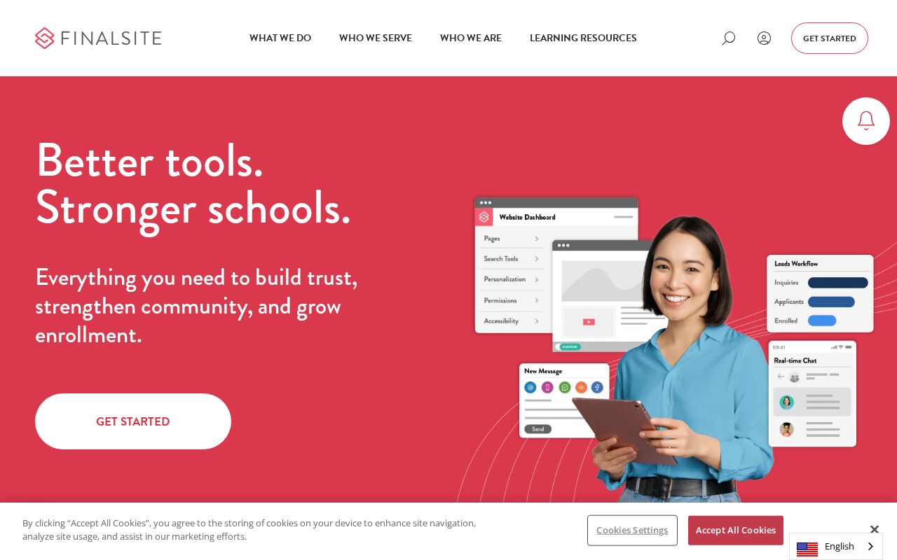
“Foster a love of learning in every student”
Hero Text: What Works in Edtech
The average edtech hero text is 5 words long. The median clarity score is 49 (above the all-industry median of 36).
Here are the highest-clarity hero texts in edtech:
“We make math and science learning seriousfun”
“LEARN YOUR WAY”
“Foster a love of learning in every student”
“MSBI Online Training”
“create interactive video”
Notice how the best hero texts name a specific action or outcome rather than using abstract language like “empower” or “transform.” Visitors should know what the product does within 3 seconds of landing.
CTAs in Edtech
The average edtech site has 6.2 CTAs on the homepage. 38% trigger decision paralysis. That is enough competing buttons to freeze visitors.
The highest-scoring CTA examples:
The best CTAs use value-oriented language (“Start free trial,” “See your results”) rather than generic text (“Learn more,” “Submit”). They promise an outcome or lower the barrier.
Audience Targeting in Edtech
38% of edtech sites have crystal-clear audience targeting. But 0% are vague or missing audience signals entirely. They don't say who the product is for.
78% use a “for [specific audience]” pattern. This is one of the simplest, highest-impact improvements: adding “for [role] at [company type]” to your hero or subhead immediately sharpens positioning.
“For X” patterns from top sites:
“for staff”
“for your classroom”
“for filmmakers”
“for students”
How Edtech Companies Position Themselves
Every homepage tells a positioning story. Here's how edtech sites break down across positioning archetypes:
The dominant archetype is Community / Movement (38% of sites). If that's your positioning too, you're competing on the same narrative as 96 other sites. Differentiation has to come from execution. Less crowded archetypes like Category Creator (0%) may offer positioning white space.
Pricing Pages
70% of edtech sites have a detectable pricing page. 50% offer a free tier.
The industry median pricing score is 0. The best pricing pages include visible prices, 2–4 clearly differentiated tiers, a comparison table, FAQ section, and social proof.
Key Takeaways
- 1CTA Effectiveness is the biggest gap. At a median of 57 (vs 57 overall), it's where most edtech sites lose points. Fix this first.
- 2Hero text should name what the product does. The highest-clarity sites use specific action verbs, not metaphors. 5 words is the industry average. Aim for under 15.
- 3Say who it's for. Only 78% use a "for [X]" pattern. Adding one is the fastest positioning win available.
- 4Keep CTAs focused. 38% of sites trigger decision paralysis. One primary CTA above the fold, with value-oriented language.
- 5Pick a less crowded archetype. 38% of sites position as Community / Movement. Standing out requires either flawless execution or a different angle.
Edtech Leaderboards
Other Industry Guides
See where your site ranks in Edtech
Get your score across all five dimensions in seconds.
Grade Your HomepageWant a team to help fix this?
Work with us