The Fintech Messaging Landscape
We analyzed 180 fintech homepages and scored them across five dimensions: messaging clarity, CTA effectiveness, ICP targeting, first impression, and pricing page quality. The median overall score is 64 out of 100 , 5 points above the all-industry median of 59.
The industry's strongest area is First Impression (median 40 vs 28 overall). Its biggest gap is Pricing Page (median 0 vs 0 overall).
What Top Fintech Sites Do Differently
The top-scoring fintech homepages share several patterns. Here's what stands out:
“Welcome to yourPortfolio Command Center.”
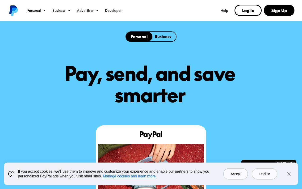
“Help others know it's you they're paying.”
“the modern way to run your financial institution”
“The Financial Wellness Platform Built for Growth”
Hero Text: What Works in Fintech
The average fintech hero text is 5 words long. The median clarity score is 43 (above the all-industry median of 36).
Here are the highest-clarity hero texts in fintech:
“Pay and manage all your bills from any device with doxo, plus FREE payment delivery options.”
“Stocks / ”
“Secure Payment Online Account”
“Global Banking & Finance Review®”
“Where institutional capital meets opportunity — connecting allocators with trusted managers”
Notice how the best hero texts name a specific action or outcome rather than using abstract language like “empower” or “transform.” Visitors should know what the product does within 3 seconds of landing.
CTAs in Fintech
The average fintech site has 7.3 CTAs on the homepage. 42% trigger decision paralysis. That is enough competing buttons to freeze visitors.
The highest-scoring CTA examples:
The best CTAs use value-oriented language (“Start free trial,” “See your results”) rather than generic text (“Learn more,” “Submit”). They promise an outcome or lower the barrier.
Audience Targeting in Fintech
6% of fintech sites have crystal-clear audience targeting. But 0% are vague or missing audience signals entirely. They don't say who the product is for.
62% use a “for [specific audience]” pattern. This is one of the simplest, highest-impact improvements: adding “for [role] at [company type]” to your hero or subhead immediately sharpens positioning.
“For X” patterns from top sites:
“for You Pay”
“for You PayPal”
“for Banks”
“for entrepreneurs”
How Fintech Companies Position Themselves
Every homepage tells a positioning story. Here's how fintech sites break down across positioning archetypes:
The dominant archetype is Price / Value (21% of sites). If that's your positioning too, you're competing on the same narrative as 36 other sites. Differentiation has to come from execution. Less crowded archetypes like Category Creator (2%) may offer positioning white space.
Pricing Pages
64% of fintech sites have a detectable pricing page. 46% offer a free tier.
The industry median pricing score is 0. The best pricing pages include visible prices, 2–4 clearly differentiated tiers, a comparison table, FAQ section, and social proof.
Key Takeaways
- 1Pricing Page is the biggest gap. At a median of 0 (vs 0 overall), it's where most fintech sites lose points. Fix this first.
- 2Hero text should name what the product does. The highest-clarity sites use specific action verbs, not metaphors. 5 words is the industry average. Aim for under 15.
- 3Say who it's for. Only 62% use a "for [X]" pattern. Adding one is the fastest positioning win available.
- 4Keep CTAs focused. 42% of sites trigger decision paralysis. One primary CTA above the fold, with value-oriented language.
- 5Pick a less crowded archetype. 21% of sites position as Price / Value. Standing out requires either flawless execution or a different angle.
Fintech Leaderboards
Other Industry Guides
See where your site ranks in Fintech
Get your score across all five dimensions in seconds.
Grade Your HomepageWant a team to help fix this?
Work with us