Office Marketing Teardown
A deep-dive analysis of office.com's homepage messaging, scored 72/100 (B-).
72/100
13 points above the median of 59
Scorecard
Analysis
Office scores 72 out of 100 on homepage messaging, earning a B- grade — mixed. Across all 30,134 sites analyzed, that's above the median of 59. Within B2C SaaS / Consumer App, where the median is 64, Office lands 8 points above the industry average.
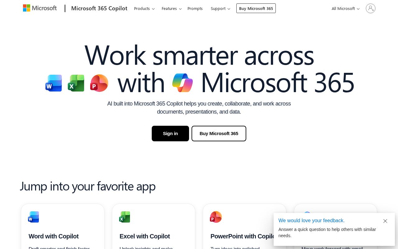
The hero text reads: "Welcome to Microsoft 365 Copilot". Lacks action verbs. The hero does not describe what the product actually does, just makes a vague claim. The language is generic — a visitor can't tell what the product does from the headline alone. With a clarity score of 62, Office is above the overall median of 36.
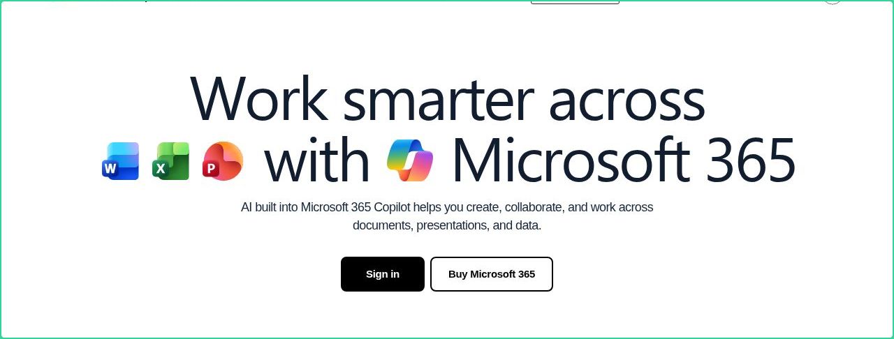
The page has 14 CTAs, 7 of them above the fold. That's enough to trigger decision paralysis — when too many buttons compete for attention, visitors often click none. The primary CTA "Contact Sales" is generic — 'Learn more' and 'Get started' don't tell visitors what happens next. CTA effectiveness score: 42 (below the median of 57).
Audience targeting is crystal clear — the homepage makes it obvious who this is for. Detected audience: enterprise / small business, B2B SaaS, student and team. Role words found: "student", "team". ICP clarity score: 80 (above the median of 35).
Office fits the "Community / Movement" archetype with moderate confidence. This means the homepage is rallying users around a mission or identity, not just a product.
On the pricing page: Office has a free tier. 6 tiers is a lot — the sweet spot is 2–4, otherwise buyers get overwhelmed comparing options. Show actual prices on your pricing page. Hidden pricing creates friction and drives visitors away.
Even at a B- grade, there's room to improve. CTAs are causing decision paralysis — reduce to one primary action above the fold. The copy uses overused buzzwords ("innovative") that dilute the message.
Hero Text
homepagerankings.com
"Welcome to Microsoft 365 Copilot"
Word count
5 words
Specificity
generic
Lacks action verbs. The hero does not describe what the product actually does, just makes a vague claim.
Subhead
"The Microsoft 365 Copilot app lets you create, share, and collaborate all in one place with innovative apps."
Calls to Action (14 found)
homepagerankings.com
Positioning: Community / Movement
The messaging rallies users around a mission or identity, not just a product. This archetype works well for open-source projects, social platforms, and mission-driven companies. The risk is sounding more like a manifesto than a product page.
Audience Targeting
Specificity
crystal-clear
Detected audience
enterprise / small business, B2B SaaS, student and team
Recommendations
- Your ICP definition is strong. Consider testing whether narrowing further (e.g., adding company stage or specific pain point) improves conversion.
First Impression
A visitor would think this is a b2b saas for someone that offers app that creates.
Pricing Page
Tiers
6
Free tier
Yes
Score
60/100
- Show actual prices on your pricing page. Hidden pricing creates friction and drives visitors away.
- Too many tiers create decision fatigue. Aim for 2-4 tiers with clear differentiation.
- Add a FAQ section to your pricing page. It addresses objections and reduces support load.
- Add social proof to your pricing page. Logos, testimonials, or customer counts reassure buyers at the decision point.
- Add a feature comparison table. It helps visitors understand the differences between tiers at a glance.
Get the same analysis for your site
Grade Your HomepageWant a team to help fix this?
Work with us