office.com
72/100
Ranked #5,571 of 46,880 sites
office.com
72/100 · #5,571 of 46,880
homepagerankings.com
B2C SaaS / Consumer App Benchmarks
How you compare to 3,549 B2C SaaS / Consumer App sites
Gray line = B2C SaaS / Consumer App median
homepagerankings.com
Analysis
Office scores 72 out of 100 on homepage messaging, earning a B- grade — mixed. Across all 30,134 sites analyzed, that's above the median of 59. Within B2C SaaS / Consumer App, where the median is 64, Office lands 8 points above the industry average.
The hero text reads: "Welcome to Microsoft 365 Copilot". Lacks action verbs. The hero does not describe what the product actually does, just makes a vague claim. The language is generic — a visitor can't tell what the product does from the headline alone. With a clarity score of 62, Office is above the overall median of 36.
The page has 14 CTAs, 7 of them above the fold. That's enough to trigger decision paralysis — when too many buttons compete for attention, visitors often click none. The primary CTA "Contact Sales" is generic — 'Learn more' and 'Get started' don't tell visitors what happens next. CTA effectiveness score: 42 (below the median of 57).
Audience targeting is crystal clear — the homepage makes it obvious who this is for. Detected audience: enterprise / small business, B2B SaaS, student and team. Role words found: "student", "team". ICP clarity score: 80 (above the median of 35).
Office fits the "Community / Movement" archetype with moderate confidence. This means the homepage is rallying users around a mission or identity, not just a product.
On the pricing page: Office has a free tier. 6 tiers is a lot — the sweet spot is 2–4, otherwise buyers get overwhelmed comparing options. Show actual prices on your pricing page. Hidden pricing creates friction and drives visitors away.
Even at a B- grade, there's room to improve. CTAs are causing decision paralysis — reduce to one primary action above the fold. The copy uses overused buzzwords ("innovative") that dilute the message.
Fix These First
up to +44 ptsRanked by estimated impact on your overall score
Reduce CTAs above the fold to one primary action
7 competing buttons cause decision paralysis — visitors click none
Make your CTA more specific
"Get started" is generic — tie it to an outcome ("Start building" or "See your report")
Rewrite your hero headline
Generic language — visitors can't tell what you do from the headline alone
Replace overused buzzwords with specifics
Phrases like "innovative" in your above-fold copy hurt credibility
Simplify your above-fold copy
Grade level 79 reads like an academic paper — aim for grade 8-10
First Impression
D (52/100)“A visitor would think this is a b2b saas for someone that offers app that creates.”
B2B SaaS
Unknown
app that creates
Time Savings / Speed
Professional
Gaps:
- -No clear target audience defined. Could be for anyone, which means it resonates with no one.
- -Value proposition is weakly communicated. Benefits are implied, not stated.
Suggested Rewrites
Better copy based on your product signals — click to copy
Current
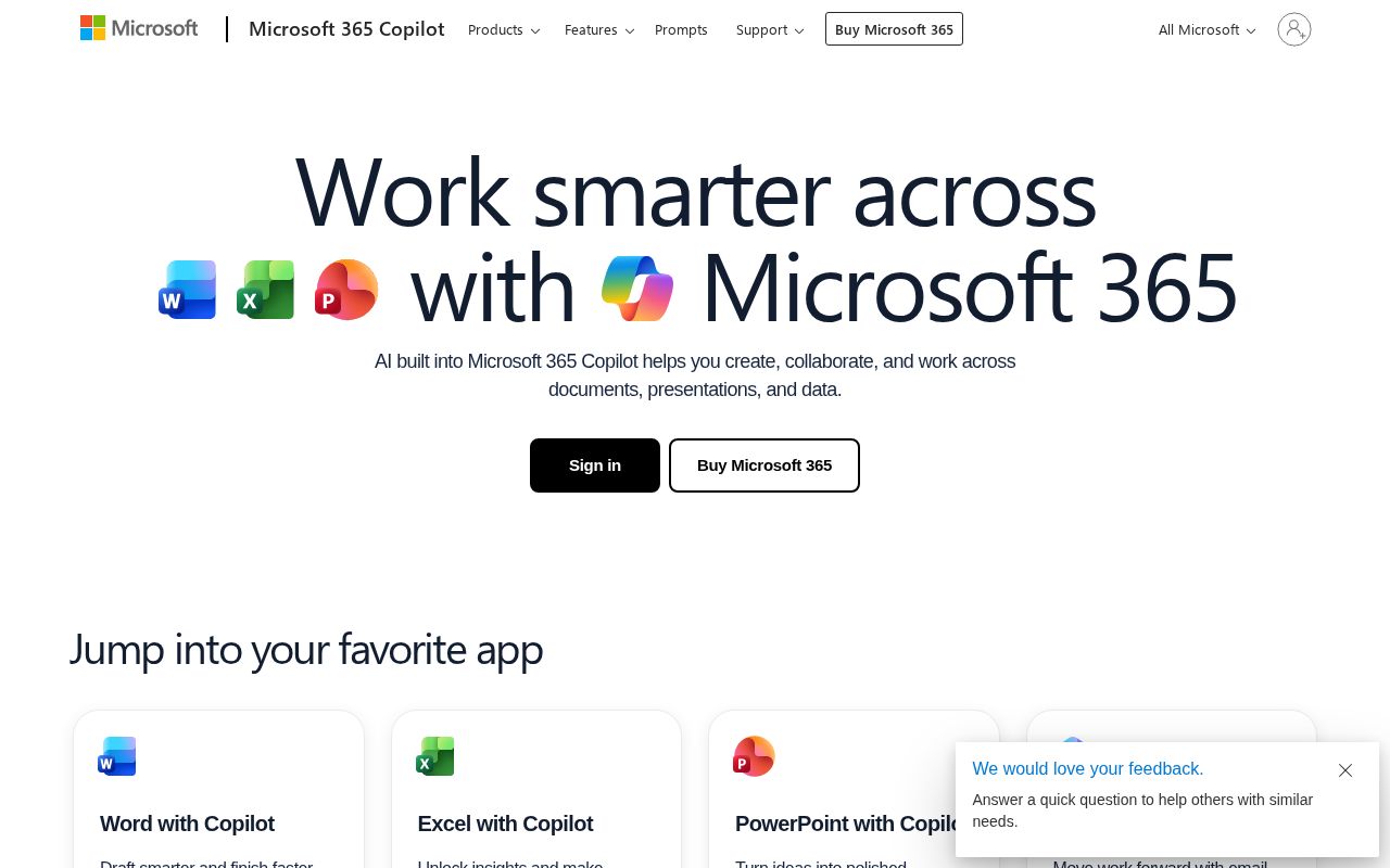
Welcome to Microsoft 365 Copilot
Your current headline is generic — these alternatives name what you do for whom
Current
Contact Sales
Tying your CTA to a specific outcome increases click-through
A/B Test Ideas
Specific experiments to run, ranked by expected impact
Remove all secondary CTAs above the fold — keep only one primary action
7 competing CTAs detected. Single-CTA pages typically convert 20-30% better.
Test adding "free" or "no card required" to your primary CTA
Risk-reducing modifiers typically lift click-through 10-15%
Test a "free" modifier on your CTA: "Contact Sales" vs "Contact Sales — Free"
"Free" is the highest-converting modifier across 27K+ homepages analyzed
Test a hero headline that names your product category explicitly
Generic headlines force visitors to scroll to understand what you sell. Test naming the category in the first 5 words.
Test adding social proof above the fold (customer count, logos, or testimonial)
No social proof detected. Even one trust signal ("Join 500+ teams") can lift conversions significantly.
Messaging Clarity
CTA Analysis
D+ (42/100)Total CTAs
14
Above Fold
7
Best CTA
Tier 3
What Do You Sell?
B- (62/100)In 5 words:
Software to create share
Hero
genericWelcome to Microsoft 365 Copilot
Meta Description
specificMicrosoft 365 (formerly Office) with Copilot - AI that helps you write documents, create presentations, analyze data, and collaborate. Ask in plain language and get work done faster
ICP Clarity
A+ (80/100)Detected audience
crystal-clearenterprise / small business, B2B SaaS, student and team
Positioning Archetype
75% confidenceCommunity / Movement
Welcome to Microsoft 365 Copilot
Confidence: 75%
Pricing Page
C+ (60/100)6 pricing tiers detected
How You Compare
vs. other B2C SaaS / Consumer App sites in the index
| Dimension | office.com | traveljoy.com | sendcloud.com | brainstormfor… | newzenler.com |
|---|---|---|---|---|---|
| Overall | 72 | 89-17 | 88-16 | 87-15 | 87-15 |
| Clarity | 62 | 59 | 72-10 | 87-25 | 72-10 |
| CTA | 42 | 85-43 | 85-43 | 60-18 | 90-48 |
| ICP | 80 | 58+22 | 90-10 | 84 | 90-10 |
| 1st Impr. | 52 | 78-26 | 52 | 40+12 | 40+12 |
| Pricing | 60 | 80-20 | 80-20 | 0+60 | 100-40 |
What We Analyzed
Title
Microsoft 365 | Write, Create & Collaborate with AI
Word count
984
Hero text
Welcome to Microsoft 365 Copilot
More in B2C SaaS / Consumer App
View B2C SaaS / Consumer App benchmarks →Track Your Progress
This report was generated recently. Make changes to your homepage, then re-scan to see your new score.
office.com scored 72/100.
We fix exactly this. Messaging, CTAs, positioning. Ready-to-ship, not a slide deck.
Work with us