usebutton.com
79/100
Ranked #1,048 of 46,880 sites
usebutton.com
79/100 · #1,048 of 46,880
homepagerankings.com
Media / Content / Publishing Benchmarks
How you compare to 6,908 Media / Content / Publishing sites
Gray line = Media / Content / Publishing median
homepagerankings.com
Analysis
Usebutton scores 79 out of 100 on homepage messaging, earning a A+ grade — mixed. Across all 30,134 sites analyzed, that's well above the median of 59. Within Media / Content / Publishing, where the median is 62, Usebutton lands 17 points above the industry average.
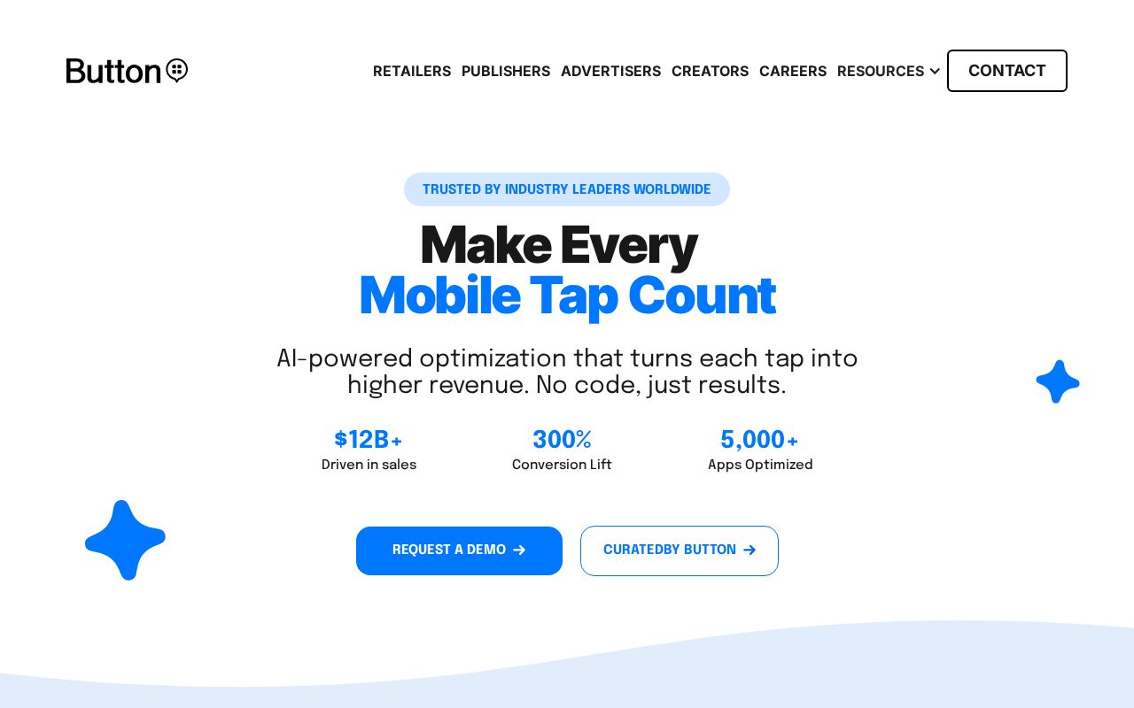
The hero text reads: "CURATEDBY BUTTON". Lacks action verbs. The hero does not describe what the product actually does, just makes a vague claim. The language is generic — a visitor can't tell what the product does from the headline alone. With a clarity score of 59, Usebutton is above the overall median of 36.
The page has 5 CTAs, 2 of them above the fold. The primary CTA "REQUEST A DEMO" is a value-oriented CTA — it promises a benefit, not just an action. CTA effectiveness score: 75 (above the median of 57).
Audience targeting is crystal clear — the homepage makes it obvious who this is for. Detected audience: B2B SaaS, marketer and professional. Role words found: "marketer", "professional". The site uses a "for [X]" pattern: "a user". ICP clarity score: 81 (above the median of 35).
Usebutton fits the "Platform / Ecosystem" archetype with moderate confidence. This means the homepage is positioning as a platform others build on — emphasizing integrations, extensibility, and ecosystem over a single feature.
On the pricing page: Usebutton has social proof elements. 2 pricing tiers is a solid structure. Consider adding a free tier or free trial. It reduces friction and lets prospects experience your product before paying.
Even at a A+ grade, there's room to improve. The copy uses overused buzzwords ("empower", "supercharge") that dilute the message. First impression clarity is below median — visitors can't quickly tell what category this product falls into.
Fix These First
up to +21 ptsRanked by estimated impact on your overall score
Rewrite your hero headline
Generic language — visitors can't tell what you do from the headline alone
Close first-impression gaps
Visitors can't quickly tell who it's for and what it does — those signals should be above the fold
Add a free tier or annual billing option
Low-commitment entry points (free tier, annual discount) reduce purchase friction
First Impression
F (20/100)“A visitor would think this is a b2b saas for someone that offers something unclear.”
B2B SaaS
Unknown
Unknown
Cost Savings / Money
Professional
Gaps:
- -Business category is implied but not clearly stated.
- -No clear target audience defined. Could be for anyone, which means it resonates with no one.
- -Product function unclear from above-fold copy. Visitors cannot tell what this does.
- -Value proposition is weakly communicated. Benefits are implied, not stated.
Suggested Rewrites
Better copy based on your product signals — click to copy
Current
CURATEDBY BUTTON
Your current headline is generic — these alternatives name what you do for whom
A/B Test Ideas
Specific experiments to run, ranked by expected impact
Test a hero headline that names your product category explicitly
Generic headlines force visitors to scroll to understand what you sell. Test naming the category in the first 5 words.
Test adding an annual/monthly billing toggle with a discount
Annual billing toggles with visible savings ("Save 20%") are a standard conversion lever.
Test adding a one-line product description directly under your hero
Visitors can't tell what you do from the above-fold content. A single explanatory line can fix this.
Messaging Clarity
CTA Analysis
B (75/100)Total CTAs
5
Above Fold
2
Best CTA
Tier 2
What Do You Sell?
C (59/100)Hero
genericCURATEDBY BUTTON
Meta Description
specificButton empowers the world's biggest Brands to supercharge their mobile marketing and ad performance using identity, deep linking, and machine learning technology.
ICP Clarity
B+ (81/100)Detected audience
crystal-clearB2B SaaS, marketer and professional
Positioning Archetype
55% confidencePlatform / Ecosystem
CURATEDBY BUTTON
Confidence: 55%
Pricing Page
A+ (95/100)2 pricing tiers detected
How You Compare
vs. other Media / Content / Publishing sites in the index
| Dimension | usebutton.com | keap.com | zight.com | infusionsoft.… | managewp.com |
|---|---|---|---|---|---|
| Overall | 79 | 87-8 | 87-8 | 87-8 | 86-7 |
| Clarity | 59 | 59 | 100-41 | 59 | 100-41 |
| CTA | 75 | 75 | 60+15 | 75 | 75 |
| ICP | 81 | 46+35 | 91-10 | 46+35 | 15+66 |
| 1st Impr. | 20 | 60-40 | 60-40 | 60-40 | 52-32 |
| Pricing | 95 | 95 | 80+15 | 95 | 100-5 |
What We Analyzed
Title
Home
Word count
390
Hero text
CURATEDBY BUTTON
More in Media / Content / Publishing
View Media / Content / Publishing benchmarks →Track Your Progress
Last scanned 63 days ago. Time to check if your homepage has improved.
usebutton.com scored 79/100.
We fix exactly this. Messaging, CTAs, positioning. Ready-to-ship, not a slide deck.
Work with us