Homepage report, Defense & GovTech
singularityus.com
Ranked #13,807 of 30,521 homepages.
Vague headline and weak main button. A visitor has to guess what it does.
62/100
C+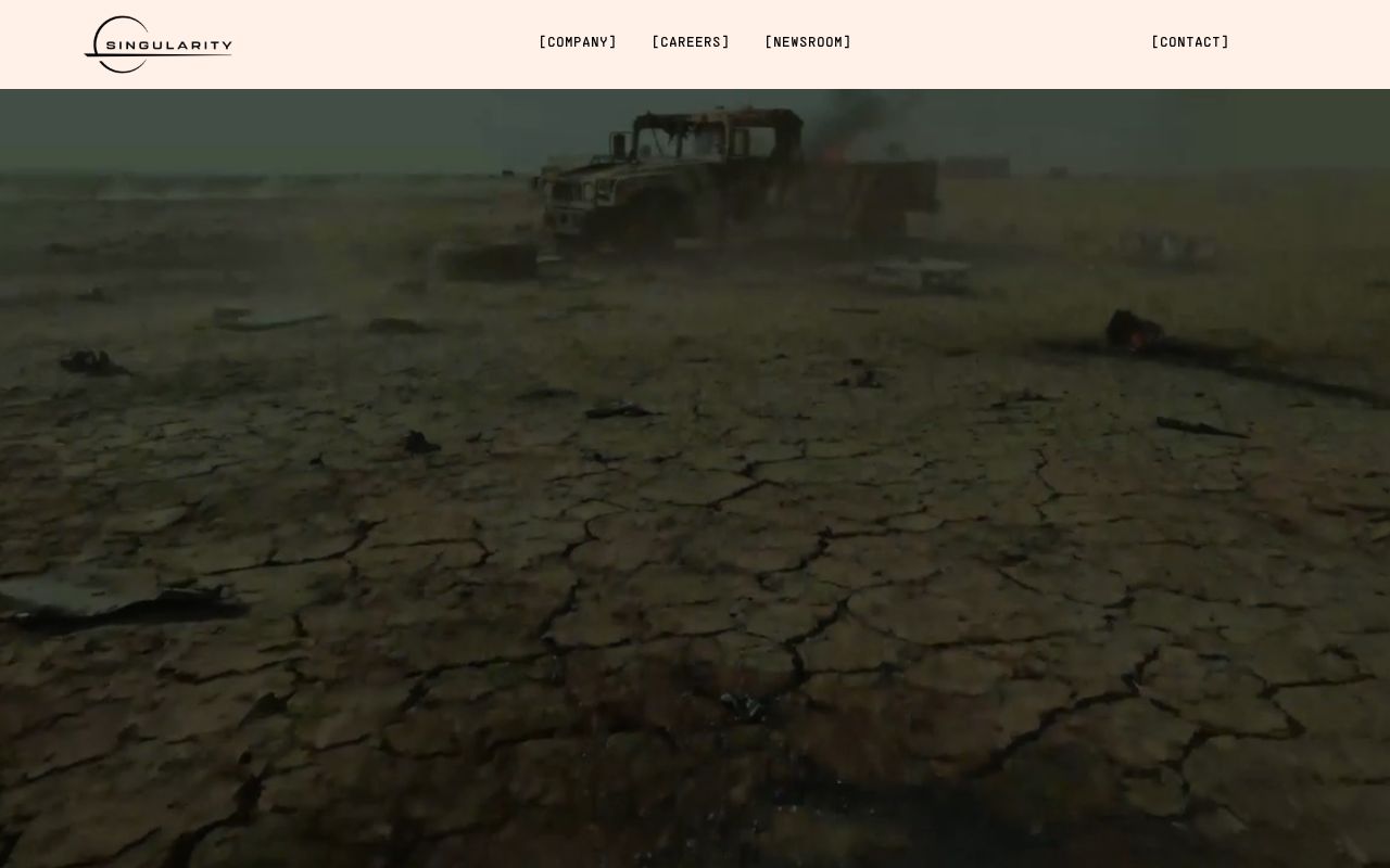
First screen at 1280px wide.
What we noticed
- 1
The headline doesn’t say what Singularityus does.
“WE FOCUS ON COUNTERING THE MOST URGENT THREATS HUMANITY FACES.” could sit on a lot of homepages. A first-time visitor still has to guess what you sell.
Try: Say what it is and who it’s for, in plain words, in the headline itself.
- 2
The main button is “LEARN MORE”.
It asks for a click without saying what happens next.
Try: Name what they get: a demo, a quote, a free trial, a price.
- 3
Nothing near the top says anyone else uses it.
No customer logos, numbers or quotes show up near the headline.
Try: Add a short proof line under the buttons: a customer count, a few logos or one real quote.
Defense & GovTech Benchmarks
How you compare to 240 Defense & GovTech sites
Gray line = Defense & GovTech median
Analysis
Singularityus scores 62 out of 100, a C+. The basics are there, but the message is generic enough to blend in with competitors. That puts it around the middle of the 30,521 homepages we've ranked, where the median is 60. That's in line with the Defense & GovTech median of 63.
The headline reads "WE FOCUS ON COUNTERING THE MOST URGENT THREATS HUMANITY FACES.". The headline makes a broad claim without saying what the product actually does. Its clarity score of 26 is below the overall median of 39.
The page has 2 CTAs, 2 of them above the fold. That's a focused set that won't overwhelm visitors. The main button, "LEARN MORE", falls in the "Passive" tier.
There are signals about who this is for, but the audience could be sharper. Detected audience: Defense & GovTech, team. It uses a "for [audience]" line: "decades". Its ICP score is 50, above the median of 35.
Here's where Singularityus has the most to gain. Clarity sits 13 points below the median. The headline needs to say what the product does in plain language.
Fix These First
up to +51 ptsRanked by estimated impact on your overall score
Rewrite your hero headline
The wording is generic, so visitors can't tell what you do from the headline alone
Add a pricing page
Hidden pricing adds friction, since most buyers want to qualify themselves before talking to sales
Close first-impression gaps
Visitors can't quickly tell what it does and why it matters. That should be clear above the fold
Upgrade your primary CTA from "LEARN MORE"
Passive CTAs like "Learn more" don't tell visitors what happens next
Shift copy from "we" to "you"
Your above-fold copy says "we" 8x but "you" only 1x. Visitors care about their problems, not yours
First Impression
F (32/100)“A visitor would think this is a defense & govtech for hr that offers something unclear.”
| What kind of company? | Defense & GovTech | clear |
|---|---|---|
| Who is it for? | HR | vague |
| What does it do? | Unknown | missing |
| What's the benefit? | None detected | missing |
| What's the vibe? | Playful | vague |
Gaps:
- -Target audience is hinted at but not explicitly called out.
- -Product function unclear from above-fold copy. Visitors cannot tell what this does.
- -No discernible value proposition. The page does not explain why someone should care.
Want a human to tear down singularityus.com?
Each week Alex Stonehouse of Brilliantly Wrong records five free video teardowns for sites that ask. Each one covers what a first-time buyer takes away and the three fixes that matter most.
Suggested Rewrites
Rewrites based on what your page says. Click one to copy it.
Current
WE FOCUS ON COUNTERING THE MOST URGENT THREATS HUMANITY FACES.
Your headline is generic. These alternatives say what you do and for whom
Current
LEARN MORE
Passive CTAs like this don't tell visitors what happens next
A/B Test Ideas
Specific experiments to run, ranked by expected impact
Replace "LEARN MORE" with an outcome-specific CTA
Passive CTAs leave visitors guessing. Test "See your report" or "Start building for free".
Test a "free" modifier on your CTA: "LEARN MORE" vs "LEARN MORE: Free"
"Free" is the strongest CTA modifier in the homepages we score
Test a hero headline that names your product category explicitly
Generic headlines force visitors to scroll to understand what you sell. Test naming the category in the first 5 words.
Rewrite above-fold copy from "we" language to "you" language
Your copy says "we" 8x and "you" 1x. Visitor-centric copy typically converts better.
Test adding a one-line product description directly under your hero
Visitors can't tell what you do from the above-fold content. A single explanatory line can fix this.
Messaging Clarity
CTA Analysis
D (42/100)Total CTAs
2
Above Fold
2
Best CTA
Tier 4
What Do You Sell?
F (26/100)In 5 words:
Scale speed
Hero
genericWE FOCUS ON COUNTERING THE MOST URGENT THREATS HUMANITY FACES.
Meta Description
absentICP Clarity
C- (50/100)Detected audience
decentDefense & GovTech, team
Pricing Page
F (0/100)No pricing page detected.
How You Compare
vs. other Defense & GovTech sites in the index
| Dimension | singularityus.com | interos.ai | eunasolutions… | exiger.com | indigov.com |
|---|---|---|---|---|---|
| Overall | 62 | 85-23 | 79-17 | 79-17 | 79-17 |
| Clarity | 26 | 49-23 | 59-33 | 46-20 | 43-17 |
| CTA | 42 | 60-18 | 75-33 | 45 | 60-18 |
| ICP | 50 | 79-29 | 81-31 | 63-13 | 55-5 |
| 1st Impr. | 32 | 28 | 60-28 | 60-28 | 52-20 |
| Pricing | 0 | 0 | 100-100 | 0 | 0 |
What We Analyzed
Title
Singularity Defense Corp
Word count
375
Hero text
WE FOCUS ON COUNTERING THE MOST URGENT THREATS HUMANITY FACES.
More in Defense & GovTech
View Defense & GovTech benchmarks →Track Your Progress
Scanned October 2026. If singularityus.com has changed since, re-scan to see the new score.
singularityus.com scored 62/100.
We fix exactly this. Messaging, CTAs, positioning. Ready-to-ship, not a slide deck.
Work with us