nginx.org
39/100
Ranked #38,365 of 46,880 sites
nginx.org
39/100 · #38,365 of 46,880
homepagerankings.com
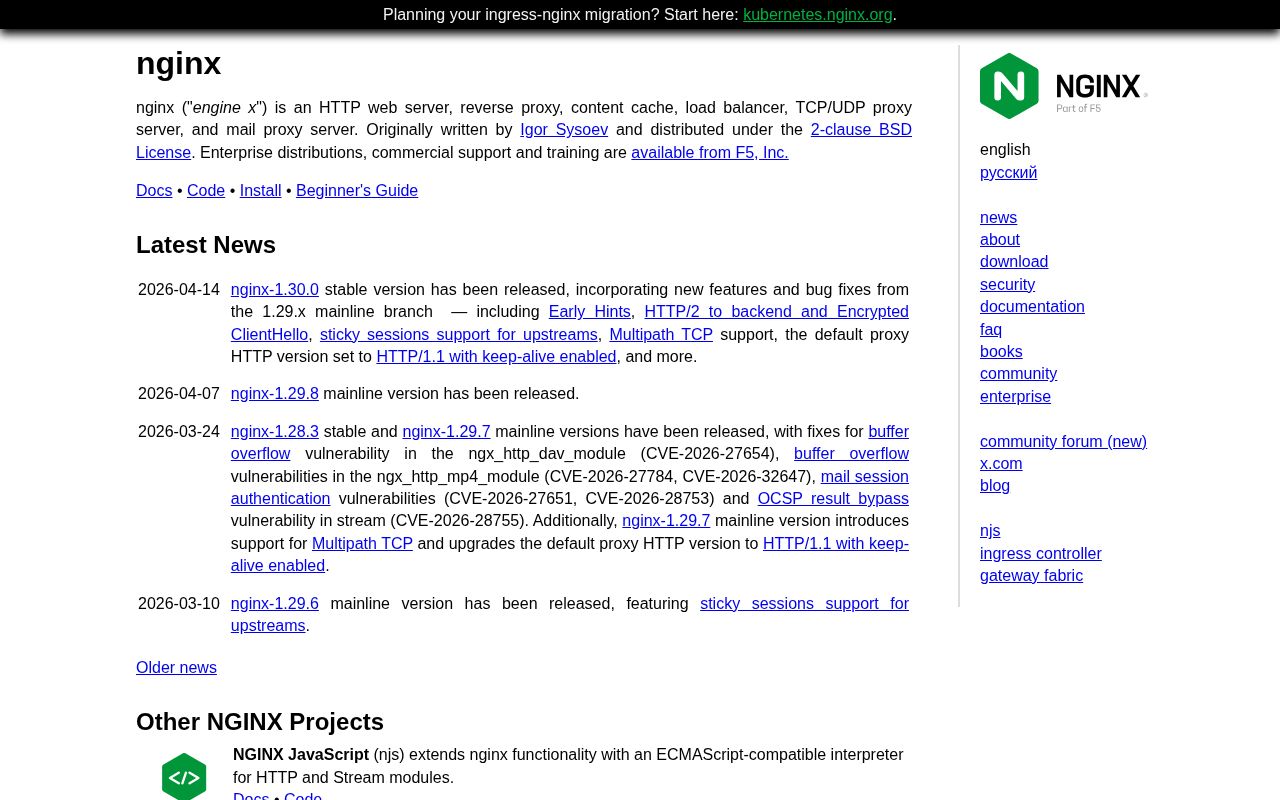
Developer Tools / Infrastructure Benchmarks
How you compare to 6,886 Developer Tools / Infrastructure sites
Gray line = Developer Tools / Infrastructure median
homepagerankings.com
Analysis
Nginx scores 39 out of 100 on homepage messaging, earning a D+ grade — mixed. Across all 30,134 sites analyzed, that's well below the median of 59. Within Developer Tools / Infrastructure, where the median is 60, Nginx lands 21 points below the industry average.
No hero text found. Visitors see nothing above the fold that tells them what you do. With a clarity score of 24, Nginx is below the overall median of 36.
The page has 3 CTAs, 3 of them above the fold. That's a focused set, which avoids overwhelming visitors. The primary CTA "Watch the CNCF webinar: ingress-nginx and NGINX I…" is generic — 'Learn more' and 'Get started' don't tell visitors what happens next. CTA effectiveness score: 45 (below the median of 57).
Audience targeting is decent — there are audience signals, but room to be more specific. Detected audience: enterprise, B2B SaaS, operator. Role words found: "operator". The site uses a "for [X]" pattern: "qjs engine in http and stream". ICP clarity score: 58 (above the median of 35).
Nginx fits the "Community / Movement" archetype with high confidence. This means the homepage is rallying users around a mission or identity, not just a product.
The biggest opportunities for Nginx: First impression clarity is below median — visitors can't quickly tell what category this product falls into. Clarity is 12 points below median — the hero text needs to say what the product does in plain language. CTA effectiveness is below median — consider using action-oriented language ("Start free trial") over generic buttons ("Learn more").
Fix These First
up to +53 ptsRanked by estimated impact on your overall score
Close first-impression gaps
Visitors can't quickly tell who it's for and what it does — those signals should be above the fold
Add a pricing page
Hiding pricing creates friction — most buyers want to self-qualify before talking to sales
Add a clear hero headline
No hero headline detected — the most important real estate on your page is empty
Make your CTA more specific
"Get started" is generic — tie it to an outcome ("Start building" or "See your report")
First Impression
F (12/100)“A visitor would think this is a b2b saas for someone that offers something unclear.”
B2B SaaS
Unknown
Unknown
None detected
Professional
Gaps:
- -Business category is implied but not clearly stated.
- -No clear target audience defined. Could be for anyone, which means it resonates with no one.
- -Product function unclear from above-fold copy. Visitors cannot tell what this does.
- -No discernible value proposition. The page does not explain why someone should care.
Suggested Rewrites
Better copy based on your product signals — click to copy
Current
Watch the CNCF webinar: ingress-nginx and NGINX Ingress Controller
Tying your CTA to a specific outcome increases click-through
A/B Test Ideas
Specific experiments to run, ranked by expected impact
Test adding "free" or "no card required" to your primary CTA
Risk-reducing modifiers typically lift click-through 10-15%
Test a "free" modifier on your CTA: "Watch the CNCF webinar: …" vs "Watch the CNCF webinar: … — Free"
"Free" is the highest-converting modifier across 27K+ homepages analyzed
Test adding a one-line product description directly under your hero
Visitors can't tell what you do from the above-fold content. A single explanatory line can fix this.
Messaging Clarity
CTA Analysis
D+ (45/100)Total CTAs
3
Above Fold
3
Best CTA
Tier 3
What Do You Sell?
F (24/100)Hero
absentMeta Description
absentICP Clarity
C (58/100)Detected audience
decententerprise, B2B SaaS, operator
Positioning Archetype
80% confidenceCommunity / Movement
nginx
Confidence: 80%
Pricing Page
F (0/100)No pricing page detected.
How You Compare
vs. other Developer Tools / Infrastructure sites in the index
| Dimension | nginx.org | chatwoot.com | tapfiliate.com | delve.co | helpscout.com |
|---|---|---|---|---|---|
| Overall | 39 | 89-50 | 88-49 | 87-48 | 87-48 |
| Clarity | 24 | 62-38 | 100-76 | 72-48 | 100-76 |
| CTA | 45 | 73-28 | 70-25 | 78-33 | 70-25 |
| ICP | 58 | 45+13 | 95-37 | 95-37 | 50+8 |
| 1st Impr. | 12 | 52-40 | 94-82 | 66-54 | 44-32 |
| Pricing | 0 | 95-95 | 100-100 | 95-95 | 100-100 |
What We Analyzed
Title
nginx
Word count
216
More in Developer Tools / Infrastructure
View Developer Tools / Infrastructure benchmarks →Track Your Progress
Last scanned 20 days ago. If you've made changes, re-scan to see how your score moved.
nginx.org scored 39/100.
We fix exactly this. Messaging, CTAs, positioning. Ready-to-ship, not a slide deck.
Work with us