Homepage report, B2B SaaS
keelvar.com
Ranked #6,498 of 30,521 homepages.
Proof up front, vague headline. A visitor has to guess what it does.
69/100
B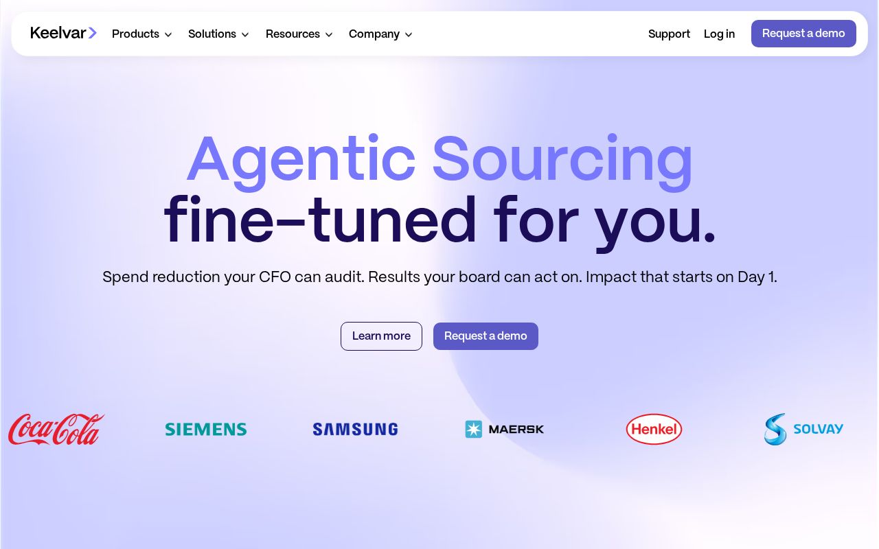
First screen at 1280px wide.
What we noticed
- 1
The headline doesn’t say what Keelvar does.
“Kai your AI orchestrator in Keelvar” could sit on a lot of homepages. A first-time visitor still has to guess what you sell.
Try: Say what it is and who it’s for, in plain words, in the headline itself.
- 2
The main button is “Learn more”.
It asks for a click without saying what happens next.
Try: Name what they get: a demo, a quote, a free trial, a price.
- 3
There’s proof near the top.
It shows awards early, so visitors know other people already use it.
- 4
It’s clear who it’s for.
The copy names its audience, so the right visitors recognize themselves quickly.
- 5
Nothing says why this and not a competitor.
We didn’t find a line only Keelvar could say: a number, a method, a guarantee.
Try: Add one claim a competitor couldn’t copy.
B2B SaaS Benchmarks
How you compare to 2,208 B2B SaaS sites
Gray line = B2B SaaS median
Analysis
Keelvar scores 69 out of 100, a B. The core message lands, but a few parts make visitors work harder than they should. That puts it in the top quarter of the 30,521 homepages we've ranked, where the median is 60. That's in line with the B2B SaaS median of 73.
The headline reads "Kai your AI orchestrator in Keelvar". The headline makes a broad claim without saying what the product actually does.
The page has 10 CTAs, 5 of them above the fold. The main button, "Learn more", falls in the "Passive" tier.
The homepage makes it obvious who this is for. Detected audience: enterprise, B2B SaaS, manager and CFO. It mentions the role "team". It uses a "for [audience]" line: "the complexity of enterprise sourcing". Its ICP score is 94, above the median of 35.
Keelvar fits the "Platform / Ecosystem" archetype with moderate confidence. The homepage is positioning itself as a platform others build on, stressing integrations and extensibility over any single feature.
The pricing page has social proof elements and an FAQ section. 5 tiers is a lot. Two to four is the sweet spot, and past that buyers get stuck comparing options. Consider adding a free tier or free trial. It reduces friction and lets prospects experience your product before paying.
Here's where Keelvar has the most to gain. The CTAs are weaker than most. Button text that names an outcome ("Start free trial") beats generic text ("Learn more"). First-impression clarity is below the median, so visitors can't quickly tell what category the product is in.
Fix These First
up to +57 ptsRanked by estimated impact on your overall score
Rewrite your hero headline
The wording is generic, so visitors can't tell what you do from the headline alone
Upgrade your primary CTA from "Learn more"
Passive CTAs like "Learn more" don't tell visitors what happens next
Close first-impression gaps
Visitors can't quickly tell who it's for and why it matters. That should be clear above the fold
Add a free tier or annual billing option
Low-commitment entry points (free tier, annual discount) reduce purchase friction
Rewrite your meta description
The meta description is generic, and it's what people see in Google results
First Impression
F (20/100)“A visitor would think this is a b2b saas for someone that offers software.”
| What kind of company? | B2B SaaS | vague |
|---|---|---|
| Who is it for? | Unknown | missing |
| What does it do? | software | vague |
| What's the benefit? | None detected | missing |
| What's the vibe? | Neutral | vague |
Gaps:
- -Business category is implied but not clearly stated.
- -No clear target audience defined. Could be for anyone, which means it resonates with no one.
- -Product description is vague. Visitors get a rough idea but no clear picture.
- -No discernible value proposition. The page does not explain why someone should care.
Want a human to tear down keelvar.com?
Each week Alex Stonehouse of Brilliantly Wrong records five free video teardowns for sites that ask. Each one covers what a first-time buyer takes away and the three fixes that matter most.
Suggested Rewrites
Rewrites based on what your page says. Click one to copy it.
Current
Kai your AI orchestrator in Keelvar
Your headline is generic. These alternatives say what you do and for whom
Current
Learn more
Passive CTAs like this don't tell visitors what happens next
Current
Spend reduction your CFO can audit. Results your board can act on. Impact that starts on Day 1.
This is what shows in Google results, and specific descriptions get more clicks
A/B Test Ideas
Specific experiments to run, ranked by expected impact
Replace "Learn more" with an outcome-specific CTA
Passive CTAs leave visitors guessing. Test "See your report" or "Start building for free".
Test a "free" modifier on your CTA: "Learn more" vs "Learn more: Free"
"Free" is the strongest CTA modifier in the homepages we score
Test a hero headline that names your product category explicitly
Generic headlines force visitors to scroll to understand what you sell. Test naming the category in the first 5 words.
Test reducing pricing tiers from 5 to 3
Too many options cause choice paralysis. The ideal is 3 tiers with a highlighted recommended plan.
Test adding an annual/monthly billing toggle with a discount
Annual billing toggles with visible savings ("Save 20%") are a standard conversion lever.
Messaging Clarity
CTA Analysis
D- (37/100)Total CTAs
10
Above Fold
5
Best CTA
Tier 4
What Do You Sell?
D+ (43/100)In 5 words:
Platform to learn more
Hero
genericKai your AI orchestrator in Keelvar
Meta Description
genericSpend reduction your CFO can audit. Results your board can act on. Impact that starts on Day 1.
ICP Clarity
A+ (94/100)Detected audience
crystal-clearenterprise, B2B SaaS, manager and CFO
Positioning Archetype
65% confidencePlatform / Ecosystem
Kai your AI orchestrator in Keelvar
Confidence: 65%
Pricing Page
A+ (90/100)5 pricing tiers detected
How You Compare
vs. other B2B SaaS sites in the index
| Dimension | keelvar.com | posteverywher… | tidio.co | tidio.com | batch.com |
|---|---|---|---|---|---|
| Overall | 69 | 88-19 | 88-19 | 88-19 | 87-18 |
| Clarity | 43 | 72-29 | 66-23 | 66-23 | 72-29 |
| CTA | 37 | 66-29 | 63-26 | 63-26 | 75-38 |
| ICP | 94 | 50+44 | 58+36 | 58+36 | 89+5 |
| 1st Impr. | 20 | 94-74 | 64-44 | 64-44 | 60-40 |
| Pricing | 90 | 90 | 95-5 | 95-5 | 0+90 |
What We Analyzed
Title
AI-Native Agentic Sourcing Software – Keelvar
Word count
1,428
Hero text
Kai your AI orchestrator in Keelvar
More in B2B SaaS
Track Your Progress
Scanned October 2026. If keelvar.com has changed since, re-scan to see the new score.
keelvar.com scored 69/100.
We fix exactly this. Messaging, CTAs, positioning. Ready-to-ship, not a slide deck.
Work with us