vonage.comvszoom.com
Homepage messaging comparison across 6 dimensions
vonage.com
68/100
Wins
3-3
zoom.com
74/100
vonage.com
vs
zoom.com
Analysis
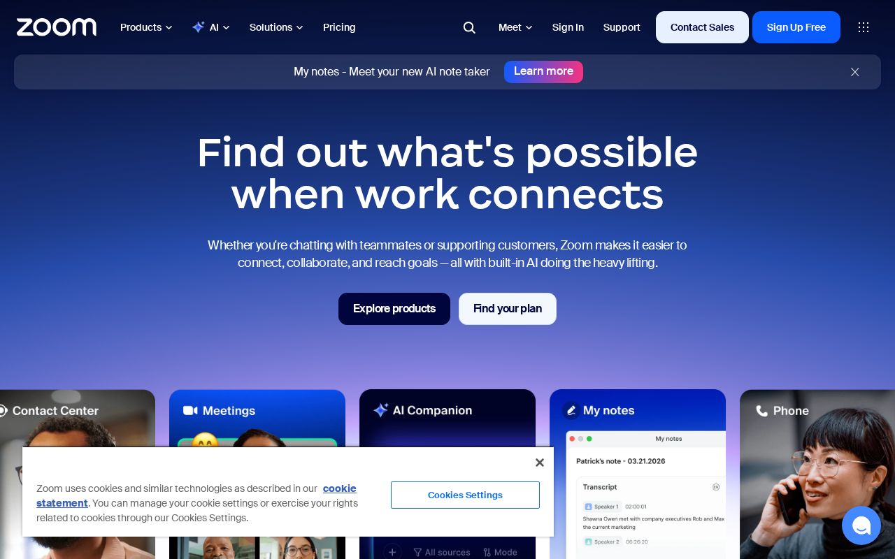
Zoom edges out Vonage modestly on homepage messaging, 74 to 68. Here's where the gap comes from.
Zoom is clearer about what it does (72 vs 34 on clarity). Zoom's hero ("Find out what's possiblewhen work connects") names something concrete, while Vonage's ("Vonage Expands Developer Ecosystem") stays abstract. Zoom has stronger CTAs (75 vs 60). Vonage triggers decision paralysis with 10 competing CTAs, while Zoom keeps it focused at 23. Vonage has a much stronger pricing page (100 vs 80).
Both sites use the "Platform / Ecosystem" positioning archetype — they're competing on the same narrative, which means differentiation has to come from execution, not framing.
Quick Insights
Archetype
Platform / Ecosystem
Archetype
Platform / Ecosystem
CTA count
10
CTA count
23
ICP
decent
ICP
decent
Compare your site against competitors
Try Competitor Map