transitapp.comvsuber.com
Homepage messaging comparison across 6 dimensions
transitapp.com
66/100
Wins
3-3
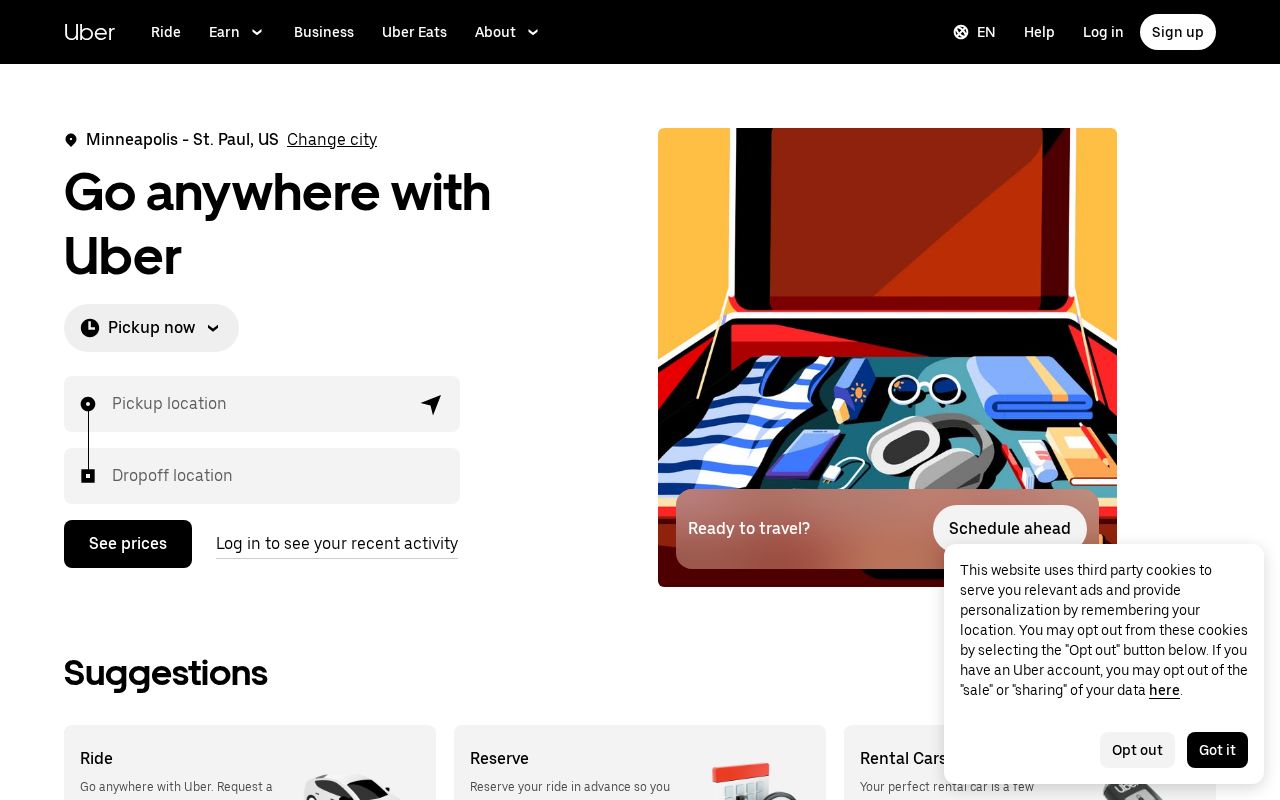
uber.com
63/100
transitapp.com
vs
uber.com
Analysis
Transitapp and Uber are nearly tied on overall homepage messaging — 66 vs 63. The difference comes down to where each invests its messaging effort.
Transitapp is clearer about what it does (66 vs 56 on clarity). Uber has stronger CTAs (75 vs 50). Transitapp is better at saying who it's for (ICP: 40 vs 0). Transitapp's targeting is decent, while Uber's is absent. Uber has a much stronger pricing page (63 vs 0). Transitapp doesn't have a detectable pricing page at all.
Transitapp uses a "Simplifier / Easy Button" positioning while Uber goes with "Platform / Ecosystem" — fundamentally different approaches to winning the same buyer.
Quick Insights
Archetype
Simplifier / Easy Button
Archetype
Platform / Ecosystem
CTA count
1
CTA count
8
ICP
decent
ICP
absent
Compare your site against competitors
Try Competitor Map