stamps.comvsusps.com
Homepage messaging comparison across 6 dimensions
stamps.com
73/100
Wins
6-0
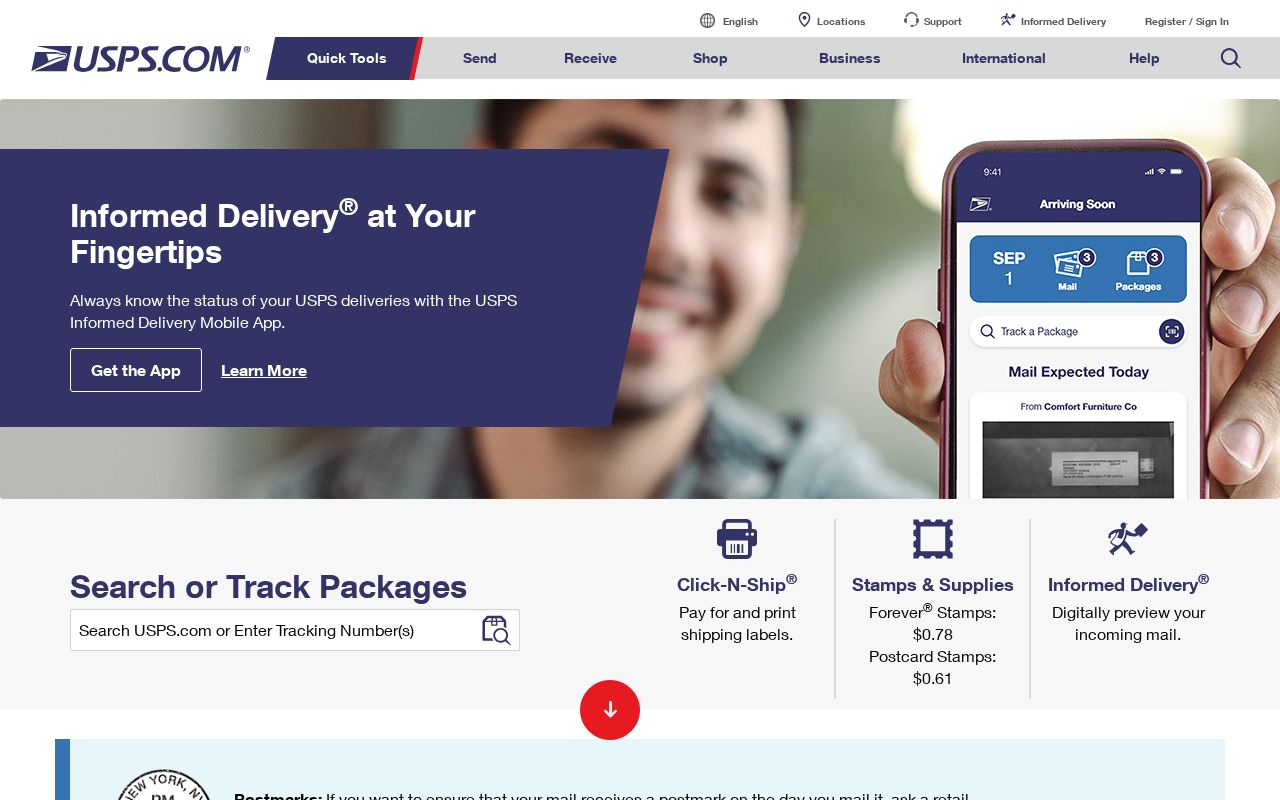
usps.com
69/100
stamps.com
vs
usps.com
Analysis
Stamps edges out Usps modestly on homepage messaging, 73 to 69. Here's where the gap comes from.
Stamps is clearer about what it does (82 vs 52 on clarity). Stamps's hero ("Mail and ship, when you want, how you want") names something concrete, while Usps's ("USPS.com Home Page") stays abstract. Stamps has stronger CTAs (88 vs 60). Usps triggers decision paralysis with 15 competing CTAs, while Stamps keeps it focused at 13.
Both sites use the "Price / Value Leader" positioning archetype — they're competing on the same narrative, which means differentiation has to come from execution, not framing.
Quick Insights
Archetype
Price / Value Leader
Archetype
Price / Value Leader
CTA count
13
CTA count
15
ICP
decent
ICP
decent
Compare your site against competitors
Try Competitor Map