shopify.comvssugarsync.com
Homepage messaging comparison across 6 dimensions
shopify.com
82/100
Wins
2-4
sugarsync.com
80/100
shopify.com
vs
sugarsync.com
Analysis
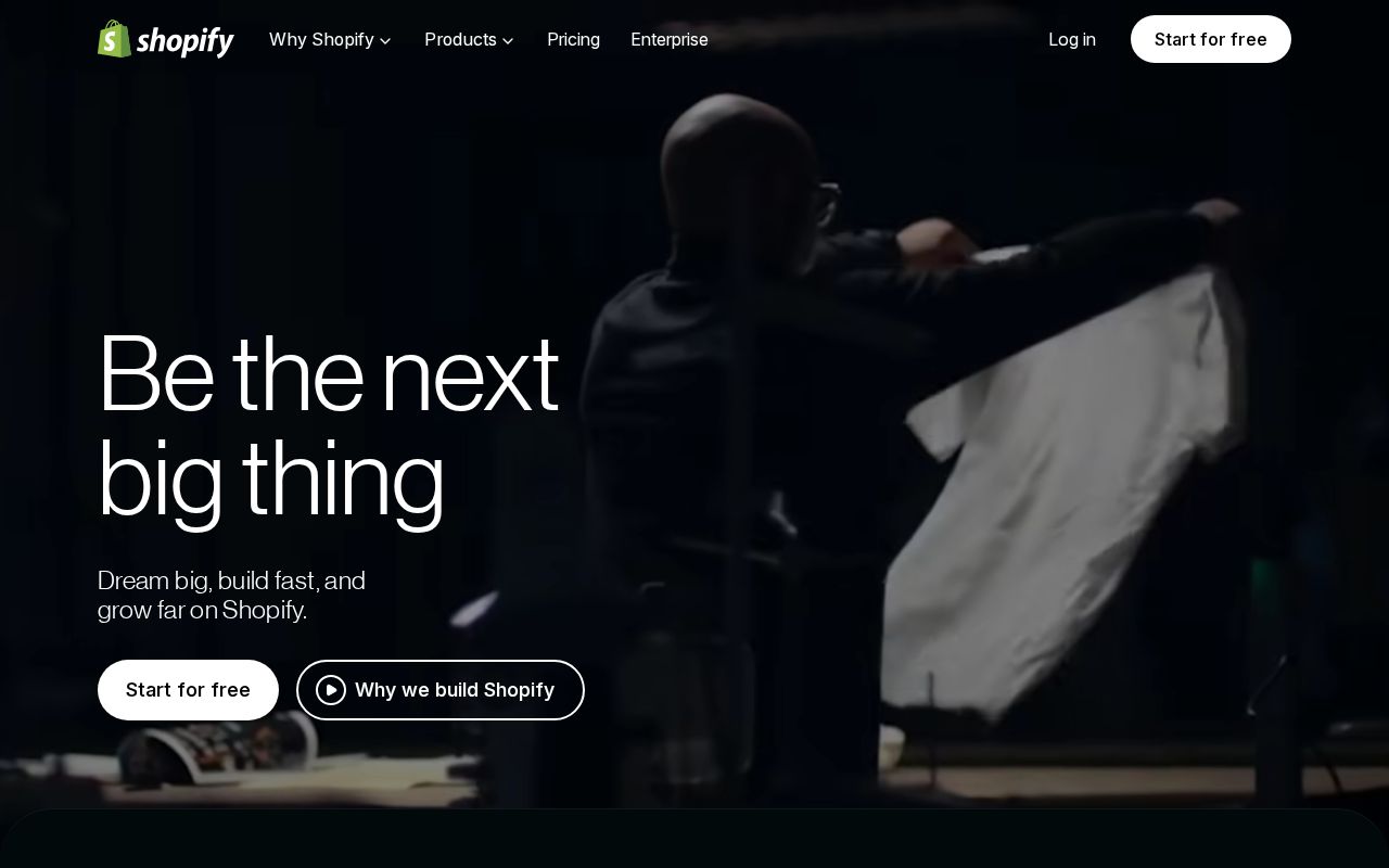
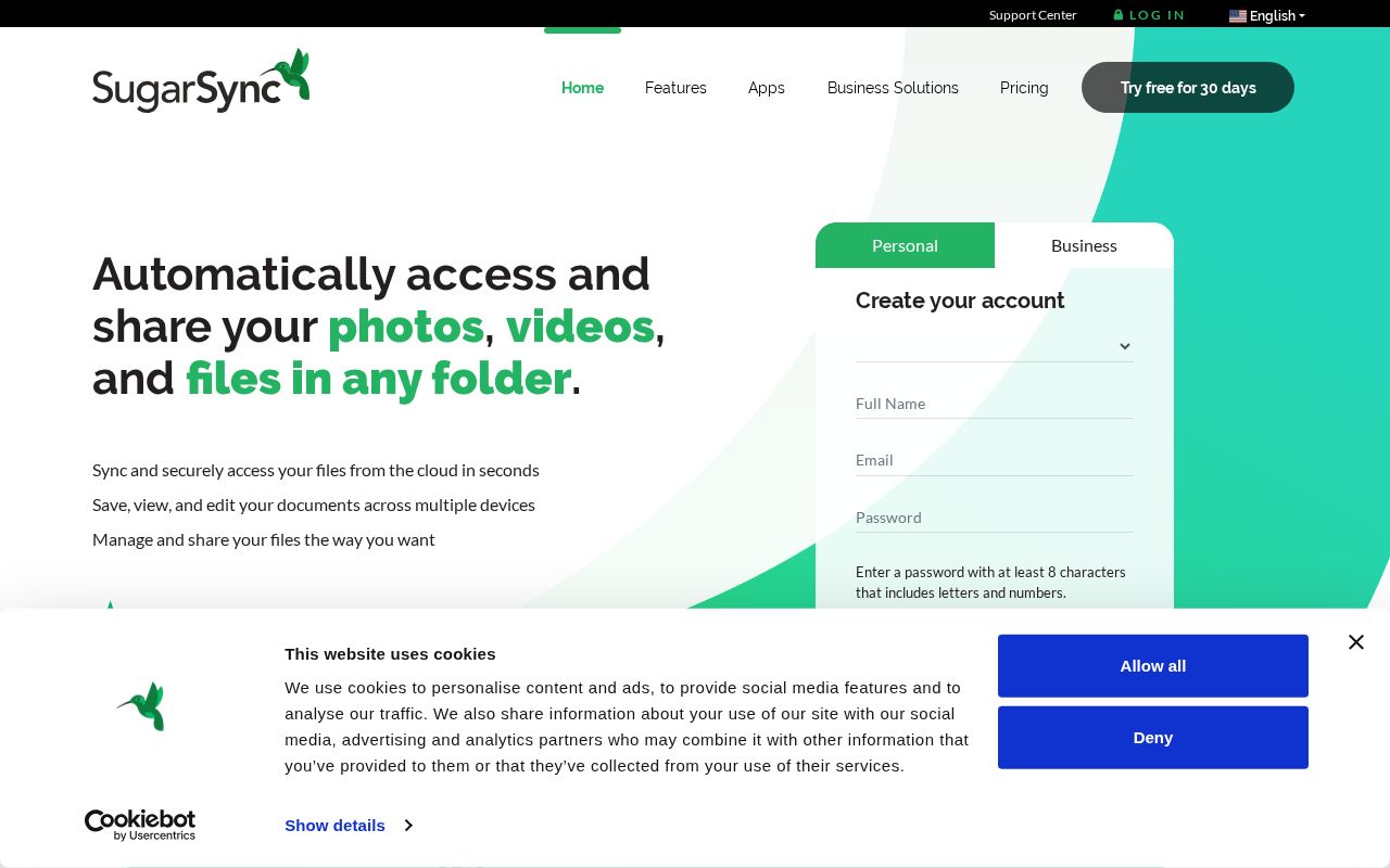
Shopify and Sugarsync are nearly tied on overall homepage messaging — 82 vs 80. The difference comes down to where each invests its messaging effort.
Sugarsync is clearer about what it does (100 vs 62 on clarity). Sugarsync's hero ("Automatically access and share your photos, videos, and fil…") names something concrete, while Shopify's ("Be the nextbig thing") stays abstract. Sugarsync has stronger CTAs (85 vs 70). Shopify triggers decision paralysis with 5 competing CTAs, while Sugarsync keeps it focused at 5. Shopify is better at saying who it's for (ICP: 86 vs 50). Shopify's targeting is crystal-clear, while Sugarsync's is decent.
Shopify uses a "Price / Value Leader" positioning while Sugarsync goes with "Simplifier / Easy Button" — fundamentally different approaches to winning the same buyer.
Quick Insights
Archetype
Price / Value Leader
Archetype
Simplifier / Easy Button
CTA count
5
CTA count
5
ICP
crystal-clear
ICP
decent
Compare your site against competitors
Try Competitor Map