render.comvsvercel.com
Homepage messaging comparison across 6 dimensions
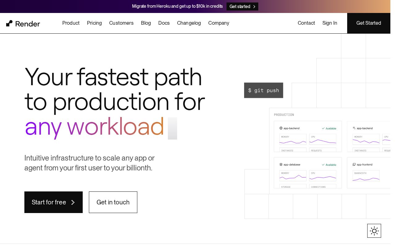
render.com
77/100
Wins
3-3
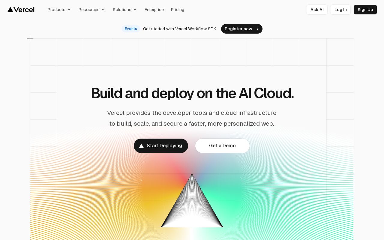
vercel.com
78/100
render.com
vs
vercel.com
Analysis
Render and Vercel are nearly tied on overall homepage messaging — 77 vs 78. The difference comes down to where each invests its messaging effort.
Vercel is clearer about what it does (90 vs 72 on clarity). Vercel's hero ("Build and deploy on the AI Cloud.") names something concrete, while Render's ("Your fastest path to production for") stays abstract. Render has stronger CTAs (70 vs 60). Render has a much stronger pricing page (100 vs 85).
Both sites use the "Platform / Ecosystem" positioning archetype — they're competing on the same narrative, which means differentiation has to come from execution, not framing.
Quick Insights
Archetype
Platform / Ecosystem
Archetype
Platform / Ecosystem
CTA count
4
CTA count
8
ICP
decent
ICP
decent
Compare your site against competitors
Try Competitor Map