notion.comvswrike.com
Homepage messaging comparison across 6 dimensions

notion.com
79/100
Wins
2-3
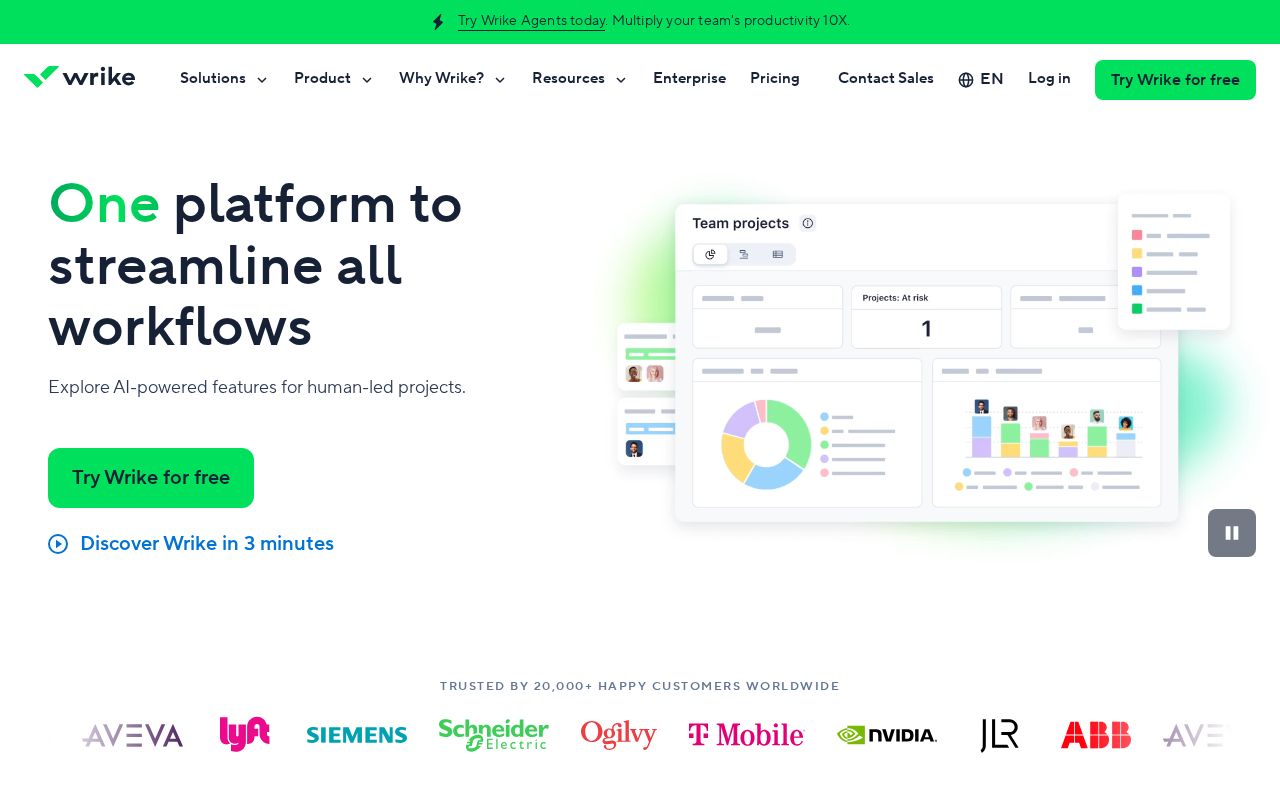
wrike.com
79/100
notion.com
vs
wrike.com
Analysis
Notion and Wrike are nearly tied on overall homepage messaging — 79 vs 79. The difference comes down to where each invests its messaging effort.
Wrike is clearer about what it does (87 vs 62 on clarity). Wrike's hero ("One platform to streamline all workflows") names something concrete, while Notion's ("One workspace. Zero busywork.") stays abstract. Wrike has stronger CTAs (75 vs 60). Notion triggers decision paralysis with 6 competing CTAs, while Wrike keeps it focused at 15. Wrike is better at saying who it's for (ICP: 68 vs 35).
Notion uses a "Trust / Authority" positioning while Wrike goes with "Platform / Ecosystem" — fundamentally different approaches to winning the same buyer.
Quick Insights
Archetype
Trust / Authority
Archetype
Platform / Ecosystem
CTA count
6
CTA count
15
ICP
decent
ICP
decent
Compare your site against competitors
Try Competitor Map