github.comvspathfactory.com
Homepage messaging comparison across 6 dimensions
github.com
83/100
Wins
4-1
pathfactory.com
75/100
github.com
vs
pathfactory.com
Analysis
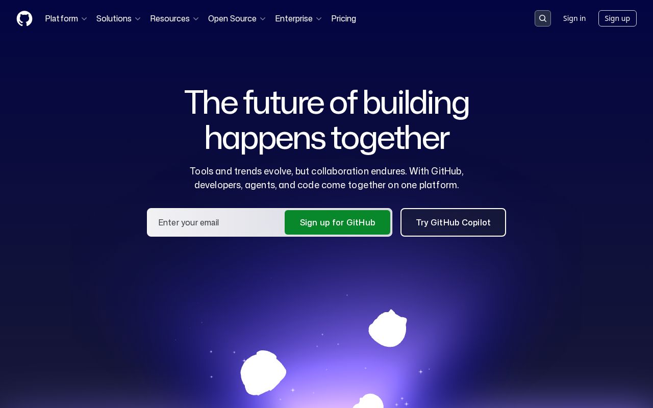
Github edges out Pathfactory modestly on homepage messaging, 83 to 75. Here's where the gap comes from.
Github is clearer about what it does (100 vs 43 on clarity). Github's hero ("Search code, repositories, users, issues, pull requests...") names something concrete, while Pathfactory's ("The Right Content. Right When Buyers Need It.") stays abstract. Pathfactory has stronger CTAs (75 vs 60). Github triggers decision paralysis with 10 competing CTAs, while Pathfactory keeps it focused at 3. Github has a much stronger pricing page (90 vs 0). Pathfactory doesn't have a detectable pricing page at all.
Github uses a "Community / Movement" positioning while Pathfactory goes with "Platform / Ecosystem" — fundamentally different approaches to winning the same buyer.
Quick Insights
Archetype
Community / Movement
Archetype
Platform / Ecosystem
CTA count
10
CTA count
3
ICP
decent
ICP
decent
Compare your site against competitors
Try Competitor Map