fillout.comvstypeform.com
Homepage messaging comparison across 6 dimensions
fillout.com
80/100
Wins
3-3
typeform.com
77/100
fillout.com
vs
typeform.com
Analysis
Fillout and Typeform are nearly tied on overall homepage messaging — 80 vs 77. The difference comes down to where each invests its messaging effort.
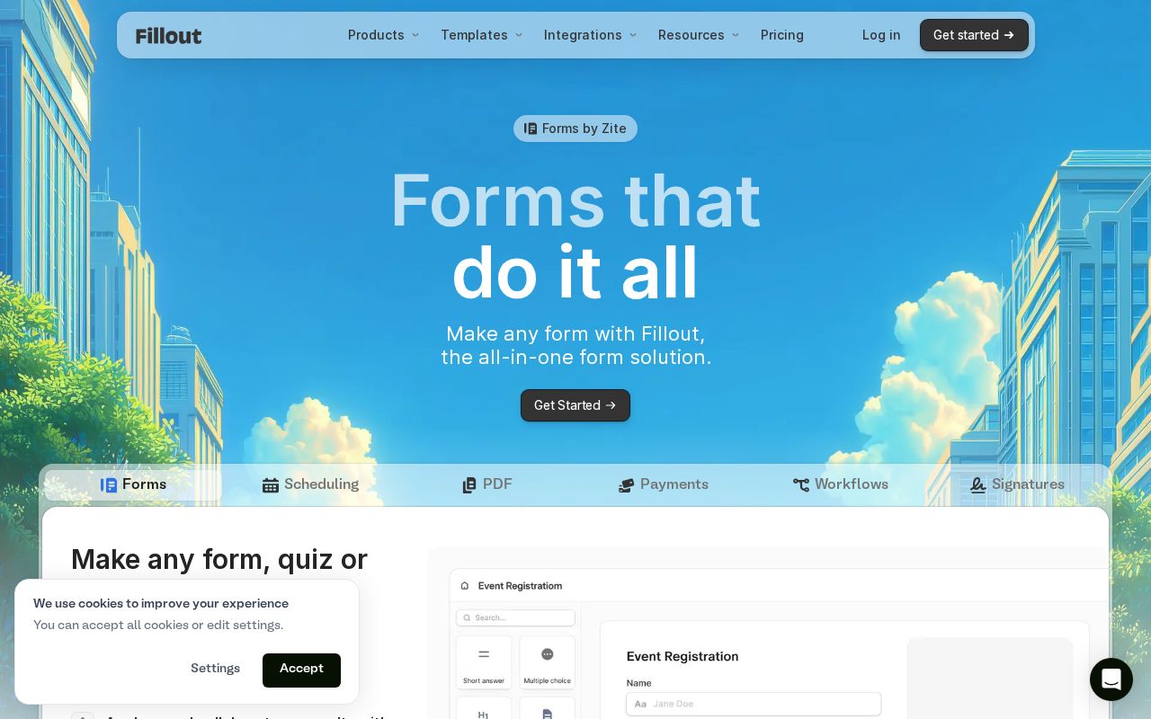
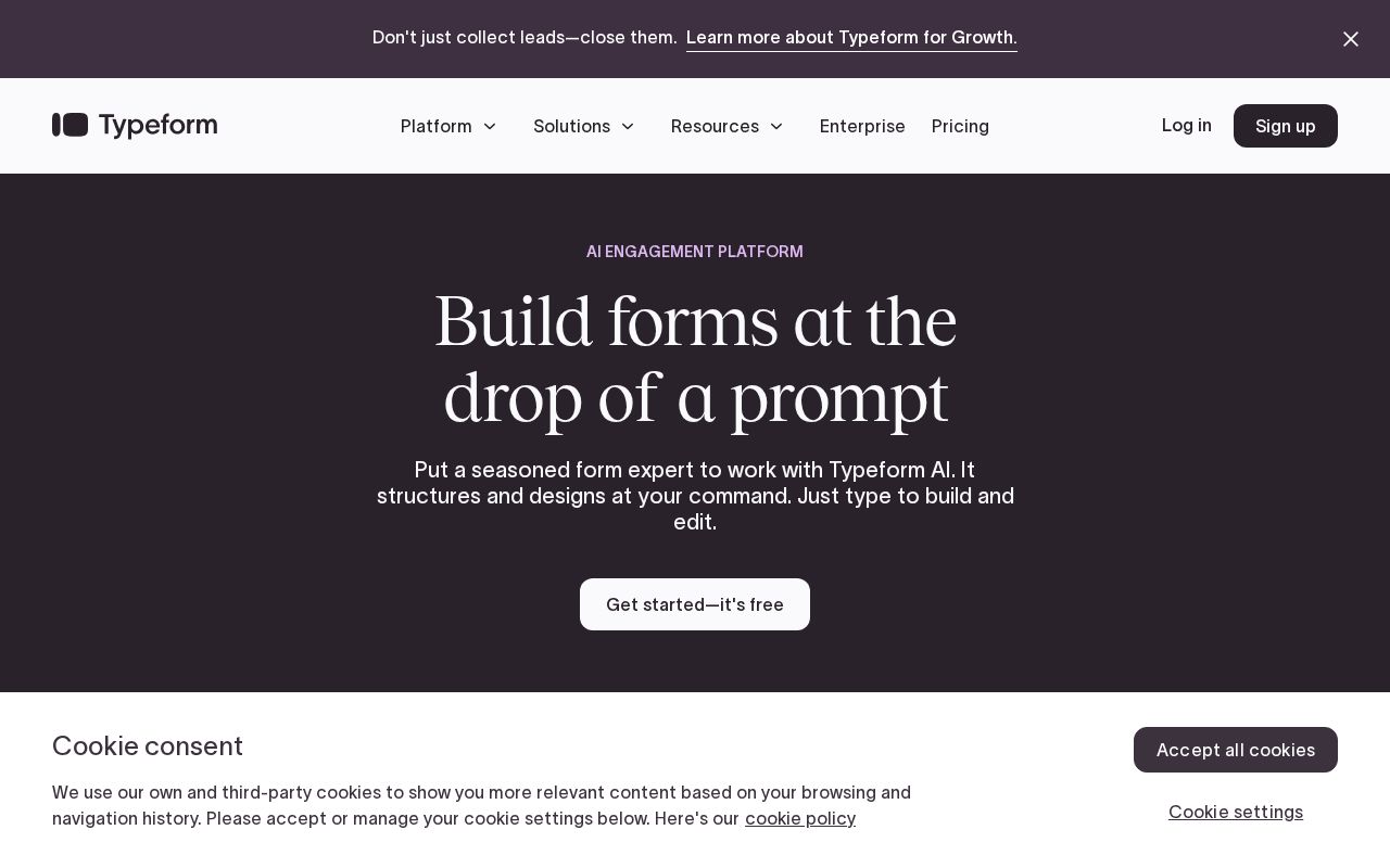
Typeform is clearer about what it does (80 vs 52 on clarity). Typeform's hero ("Build forms at the drop of a prompt") names something concrete, while Fillout's ("Forms thatthat do it allit all") stays abstract. Fillout has stronger CTAs (90 vs 63). Typeform triggers decision paralysis with 9 competing CTAs, while Fillout keeps it focused at 2. Typeform is better at saying who it's for (ICP: 95 vs 35). Typeform's targeting is crystal-clear, while Fillout's is decent.
Fillout uses a "Simplifier / Easy Button" positioning while Typeform goes with "Platform / Ecosystem" — fundamentally different approaches to winning the same buyer.
Quick Insights
Archetype
Simplifier / Easy Button
Archetype
Platform / Ecosystem
CTA count
2
CTA count
9
ICP
decent
ICP
crystal-clear
Compare your site against competitors
Try Competitor Map