cronometer.comvsmyfitnesspal.com
Homepage messaging comparison across 6 dimensions
cronometer.com
73/100
Wins
1-4
myfitnesspal.com
77/100
cronometer.com
vs
myfitnesspal.com
Analysis
Myfitnesspal edges out Cronometer modestly on homepage messaging, 77 to 73. Here's where the gap comes from.
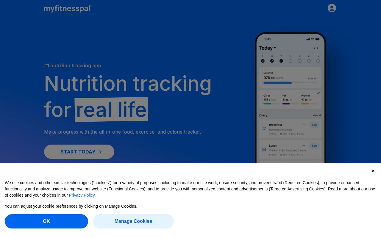
Myfitnesspal is clearer about what it does (100 vs 90 on clarity). Myfitnesspal has stronger CTAs (86 vs 52). Cronometer triggers decision paralysis with 3 competing CTAs, while Myfitnesspal keeps it focused at 7. Cronometer is better at saying who it's for (ICP: 33 vs 10). Cronometer's targeting is decent, while Myfitnesspal's is generic. Myfitnesspal has a much stronger pricing page (100 vs 0). Cronometer doesn't have a detectable pricing page at all.
Cronometer uses a "Premium / Quality Leader" positioning while Myfitnesspal goes with "Price / Value Leader" — fundamentally different approaches to winning the same buyer.
Quick Insights
Archetype
Premium / Quality Leader
Archetype
Price / Value Leader
CTA count
3
CTA count
7
ICP
decent
ICP
generic
Compare your site against competitors
Try Competitor Map