clerk.comvsstytch.com
Homepage messaging comparison across 6 dimensions
clerk.com
81/100
Wins
2-1
stytch.com
81/100
clerk.com
vs
stytch.com
Analysis
Clerk and Stytch are nearly tied on overall homepage messaging — 81 vs 81. The difference comes down to where each invests its messaging effort.
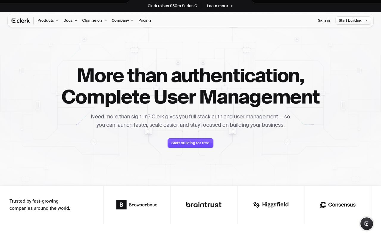
Stytch is clearer about what it does (100 vs 59 on clarity). Stytch's hero ("Scales from your first user to Fortune 100 customers") names something concrete, while Clerk's ("More than authentication, Complete User Management") stays abstract. Clerk is better at saying who it's for (ICP: 81 vs 58). Clerk's targeting is crystal-clear, while Stytch's is decent. Clerk has a much stronger pricing page (95 vs 75).
Clerk uses a "Niche Specialist" positioning while Stytch goes with "Trust / Authority" — fundamentally different approaches to winning the same buyer.
Quick Insights
Archetype
Niche Specialist
Archetype
Trust / Authority
CTA count
7
CTA count
5
ICP
crystal-clear
ICP
decent
Compare your site against competitors
Try Competitor Map