checkout.comvspaypal.com
Homepage messaging comparison across 6 dimensions

checkout.com
40/100
Wins
3-3
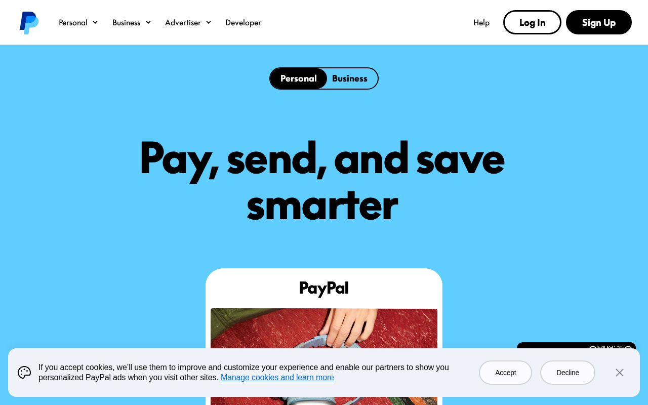
paypal.com
79/100
checkout.com
vs
paypal.com
Analysis
Paypal edges out Checkout significantly on homepage messaging, 79 to 40. Here's where the gap comes from.
Checkout is clearer about what it does (46 vs 25 on clarity). Checkout has stronger CTAs (75 vs 60). Paypal triggers decision paralysis with 12 competing CTAs, while Checkout keeps it focused at 7. Paypal is better at saying who it's for (ICP: 45 vs 15). Paypal's targeting is decent, while Checkout's is generic.
Both sites use the "Platform / Ecosystem" positioning archetype — they're competing on the same narrative, which means differentiation has to come from execution, not framing.
Quick Insights
Archetype
Platform / Ecosystem
Archetype
Platform / Ecosystem
CTA count
7
CTA count
12
ICP
generic
ICP
decent
Compare your site against competitors
Try Competitor Map