ceros.comvsmeta.com
Homepage messaging comparison across 6 dimensions
ceros.com
78/100
Wins
6-0
meta.com
55/100
ceros.com
vs
meta.com
Analysis
Ceros edges out Meta significantly on homepage messaging, 78 to 55. Here's where the gap comes from.
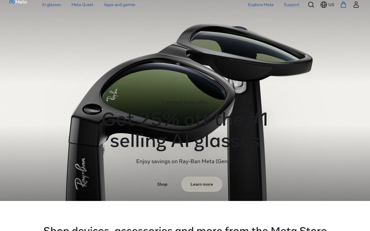
Ceros is clearer about what it does (72 vs 50 on clarity). Meta's hero ("Shop devices, accessories and more from the Meta Store") names something concrete, while Ceros's ("<img alt="logo" srcSet="/_next/image/?url=https%3A%2F%2Fcer…") stays abstract. Ceros has stronger CTAs (70 vs 42). Ceros is better at saying who it's for (ICP: 89 vs 15). Ceros's targeting is crystal-clear, while Meta's is generic. Ceros has a much stronger pricing page (100 vs 0). Meta doesn't have a detectable pricing page at all.
Quick Insights
Archetype
Simplifier / Easy Button
Archetype
Unknown
CTA count
6
CTA count
1
ICP
crystal-clear
ICP
generic
Compare your site against competitors
Try Competitor Map