calculator.netvsmyfitnesspal.com
Homepage messaging comparison across 6 dimensions
calculator.net
52/100
Wins
2-4
myfitnesspal.com
77/100
calculator.net
vs
myfitnesspal.com
Analysis
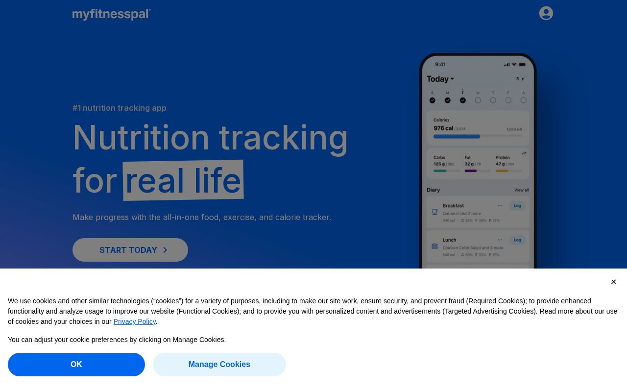
Myfitnesspal edges out Calculator significantly on homepage messaging, 77 to 52. Here's where the gap comes from.
Myfitnesspal is clearer about what it does (100 vs 27 on clarity). Myfitnesspal's hero ("#1 nutrition tracking appNutrition tracking forreal life") names something concrete, while Calculator's ("Free Online Calculators") stays abstract. Myfitnesspal has stronger CTAs (86 vs 0). Calculator is better at saying who it's for (ICP: 45 vs 10). Calculator's targeting is decent, while Myfitnesspal's is generic. Myfitnesspal has a much stronger pricing page (100 vs 0). Calculator doesn't have a detectable pricing page at all.
Both sites use the "Price / Value Leader" positioning archetype — they're competing on the same narrative, which means differentiation has to come from execution, not framing.
Quick Insights
Archetype
Price / Value Leader
Archetype
Price / Value Leader
CTA count
0
CTA count
7
ICP
decent
ICP
generic
Compare your site against competitors
Try Competitor Map