adp.comvsemployeenavigator.com
Homepage messaging comparison across 6 dimensions
employeenavigator.com
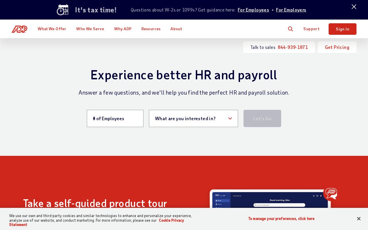
adp.com
B+
71/100
Wins
1-5
employeenavigator.com
A
77/100
adp.com
vs
employeenavigator.com
71Overall77
57CTA Effectiveness60
36First Impression60
43Clarity62
86ICP Clarity40
70Pricing Page80
Analysis
Employeenavigator edges out Adp modestly on homepage messaging, 77 to 71. Here's where the gap comes from.
Employeenavigator is clearer about what it does (62 vs 43 on clarity). Adp is better at saying who it's for (ICP: 86 vs 40). Adp's targeting is crystal-clear, while Employeenavigator's is decent.
Adp uses a "Simplifier / Easy Button" positioning while Employeenavigator goes with "Platform / Ecosystem" — fundamentally different approaches to winning the same buyer.
Quick Insights
Archetype
Simplifier / Easy Button
Archetype
Platform / Ecosystem
CTA count
5
CTA count
6
ICP
crystal-clear
ICP
decent
Compare your site against competitors
Try Competitor Map