Wordpress Marketing Teardown
A deep-dive analysis of wordpress.org's homepage messaging, scored 64/100 (B-).
64/100
5 points above the median of 59
Scorecard
Analysis
Wordpress scores 64 out of 100 on homepage messaging, earning a B- grade — mixed. Across all 30,134 sites analyzed, that's above the median of 59.
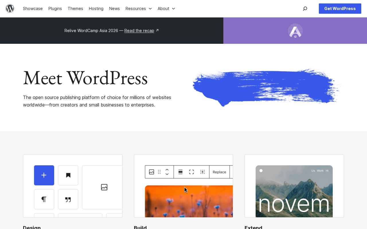
The hero text reads: "wp-pixpie". Lacks action verbs. The hero does not describe what the product actually does, just makes a vague claim. The language is generic — a visitor can't tell what the product does from the headline alone. With a clarity score of 72, Wordpress is above the overall median of 36.
The page has 1 CTA. That's a focused set, which avoids overwhelming visitors. The primary CTA "Visit our Facebook page" is high-friction — asking for commitment before proving value. CTA effectiveness score: 15 (below the median of 57).
Audience targeting is decent — there are audience signals, but room to be more specific. Detected audience: B2B SaaS. The site uses a "for [X]" pattern: "download". ICP clarity score: 45 (above the median of 35).
Wordpress fits the "Premium / Quality Leader" archetype with moderate confidence. This means the homepage is leading with craft and quality signals — the positioning says 'you get what you pay for'.
The biggest opportunities for Wordpress: CTA effectiveness is below median — consider using action-oriented language ("Start free trial") over generic buttons ("Learn more").
Hero Text
homepagerankings.com

"wp-pixpie"
Word count
1 words
Specificity
generic
Lacks action verbs. The hero does not describe what the product actually does, just makes a vague claim.
Subhead
"Description"
Calls to Action (1 found)
homepagerankings.com

Positioning: Premium / Quality Leader
The homepage leads with craft, quality, and polish. 'You get what you pay for' is the underlying message. Works when the product genuinely delivers a premium experience, but can backfire if the actual product doesn't match the marketing's tone.
Audience Targeting
Specificity
decent
Detected audience
B2B SaaS
"For X" pattern
"download"
Recommendations
- Add a pain point that your audience relates to. 'Tired of [specific frustration]?' or 'Stop wasting time on [tedious task]' makes your ICP feel seen.
First Impression
A visitor would think this is a b2b saas for hr that offers api.
Pricing Page
No pricing page detected. For most companies, this creates friction. Visitors who can't find pricing assume they can't afford it.
Compare Wordpress
Get the same analysis for your site
Grade Your HomepageWant a team to help fix this?
Work with us