Wordpress Marketing Teardown
A deep-dive analysis of wordpress.com's homepage messaging, scored 72/100 (B-).
72/100
13 points above the median of 59
Scorecard
Analysis
Wordpress scores 72 out of 100 on homepage messaging, earning a B- grade — mixed. Across all 30,134 sites analyzed, that's above the median of 59. Within B2C SaaS / Consumer App, where the median is 64, Wordpress lands 8 points above the industry average.
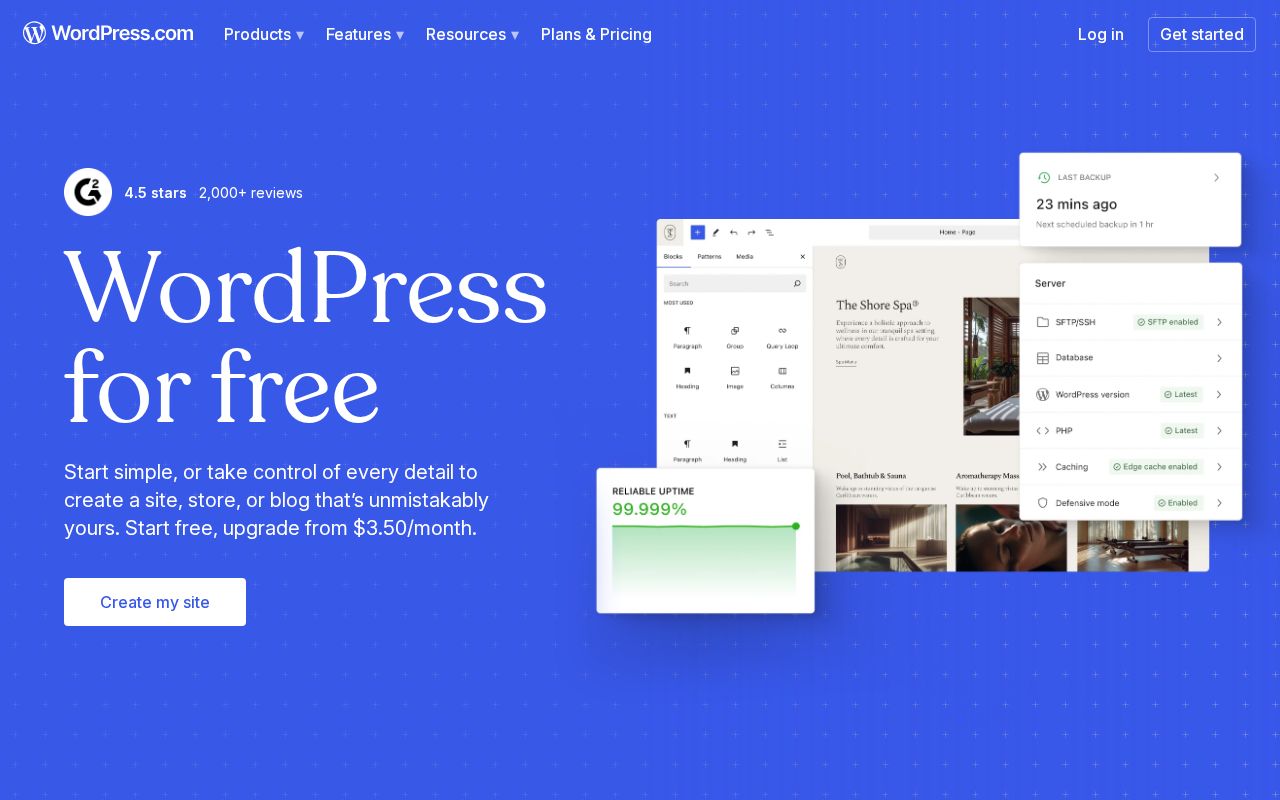
The hero text reads: "WordPress for free". Lacks action verbs. The hero does not describe what the product actually does, just makes a vague claim. The language is generic — a visitor can't tell what the product does from the headline alone. With a clarity score of 72, Wordpress is above the overall median of 36.
The page has 10 CTAs, 4 of them above the fold. That's enough to trigger decision paralysis — when too many buttons compete for attention, visitors often click none. The primary CTA "start free" is a value-oriented CTA — it promises a benefit, not just an action.
Audience targeting is decent — there are audience signals, but room to be more specific. Detected audience: enterprise, B2C SaaS / Consumer App, agency and professional. Role words found: "agency", "professional". The site uses a "for [X]" pattern: "free 4". ICP clarity score: 63 (above the median of 35).
Wordpress fits the "Price / Value Leader" archetype with high confidence.
On the pricing page: Wordpress has a free tier, an annual billing toggle, and social proof elements. 7 tiers is a lot — the sweet spot is 2–4, otherwise buyers get overwhelmed comparing options. Too many tiers create decision fatigue. Aim for 2-4 tiers with clear differentiation.
Hero Text
homepagerankings.com

"WordPress for free"
Word count
3 words
Specificity
generic
Lacks action verbs. The hero does not describe what the product actually does, just makes a vague claim.
Subhead
"4.5 stars"
Calls to Action (10 found)
homepagerankings.com
Positioning: Price / Value Leader
Audience Targeting
Specificity
decent
Detected audience
enterprise, B2C SaaS / Consumer App, agency and professional
"For X" pattern
"free 4"
Recommendations
- Add a pain point that your audience relates to. 'Tired of [specific frustration]?' or 'Stop wasting time on [tedious task]' makes your ICP feel seen.
First Impression
A visitor would think this is a b2c saas / consumer app for someone that offers tool that builds.
Pricing Page
Tiers
7
Free tier
Yes
Score
90/100
- Too many tiers create decision fatigue. Aim for 2-4 tiers with clear differentiation.
- Add a FAQ section to your pricing page. It addresses objections and reduces support load.
- Add a feature comparison table. It helps visitors understand the differences between tiers at a glance.
Get the same analysis for your site
Grade Your HomepageWant a team to help fix this?
Work with us