Windows Marketing Teardown
A deep-dive analysis of windows.net's homepage messaging, scored 69/100 (B-).
69/100
10 points above the median of 59
Scorecard
Analysis
Windows scores 69 out of 100 on homepage messaging, earning a B- grade — mixed. Across all 30,134 sites analyzed, that's above the median of 59. Within Developer Tools / Infrastructure, where the median is 60, Windows lands 9 points above the industry average.
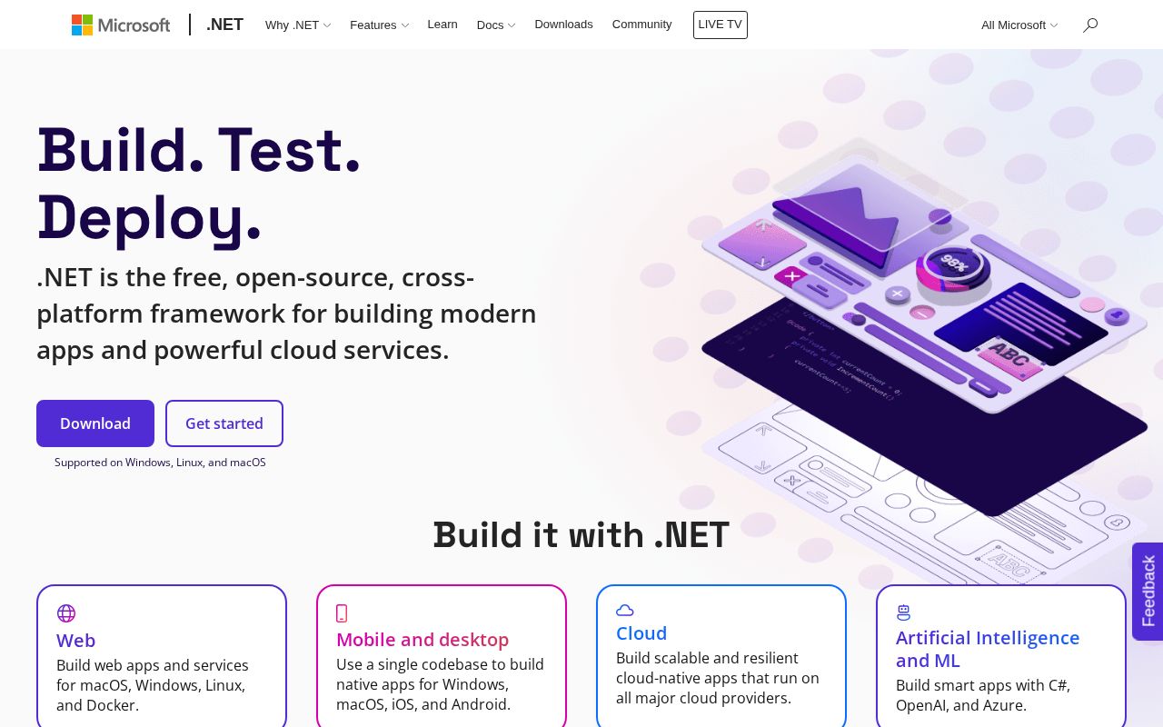
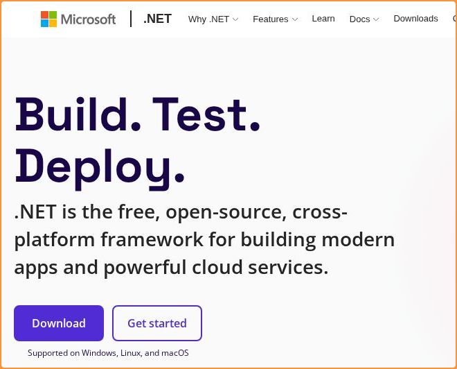
The hero text reads: "Build. Test. Deploy.". Decent. Action verbs give a sense of function, but could be more explicit about exactly what the product is. The language is specific enough that visitors get a concrete sense of what's offered. With a clarity score of 90, Windows is above the overall median of 36.
The page has 7 CTAs, 3 of them above the fold. That's enough to trigger decision paralysis — when too many buttons compete for attention, visitors often click none. The primary CTA "Get started" is a value-oriented CTA — it promises a benefit, not just an action.
Audience targeting is decent — there are audience signals, but room to be more specific. Detected audience: Developer Tools / Infrastructure, developer and team. Role words found: "developer", "team". The site uses a "for [X]" pattern: "building any type of app". ICP clarity score: 58 (above the median of 35).
Windows fits the "Platform / Ecosystem" archetype with high confidence. This means the homepage is positioning as a platform others build on — emphasizing integrations, extensibility, and ecosystem over a single feature.
On the pricing page: Windows has a free tier and social proof elements. 3 pricing tiers is a solid structure. Show actual prices on your pricing page. Hidden pricing creates friction and drives visitors away.
Hero Text
homepagerankings.com
"Build. Test. Deploy."
Word count
3 words
Specificity
specific
Decent. Action verbs give a sense of function, but could be more explicit about exactly what the product is.
Subhead
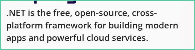
".NET is the free, open-source, cross-platform framework for building modern apps and powerful cloud services."
Calls to Action (7 found)
homepagerankings.com
Positioning: Platform / Ecosystem
The homepage positions the product as a platform others build on. The messaging emphasizes integrations, extensibility, APIs, and ecosystem, not a single feature. This archetype works when the product genuinely connects to other tools, but can feel hollow when applied to simple single-purpose products.
Audience Targeting
Specificity
decent
Detected audience
Developer Tools / Infrastructure, developer and team
"For X" pattern
"building any type of app"
Recommendations
- You mention roles but not company types. Adding 'at [company type]' helps narrow the ICP further. 'For marketers at B2B SaaS companies' is much sharper than just 'for marketers.'
- Add a pain point that your audience relates to. 'Tired of [specific frustration]?' or 'Stop wasting time on [tedious task]' makes your ICP feel seen.
First Impression
A visitor would think this is a developer tools / infrastructure for building any type of app that offers platform that builds.
Pricing Page
Tiers
3
Free tier
Yes
Score
90/100
- Show actual prices on your pricing page. Hidden pricing creates friction and drives visitors away.
- Add a FAQ section to your pricing page. It addresses objections and reduces support load.
- Add a feature comparison table. It helps visitors understand the differences between tiers at a glance.
Get the same analysis for your site
Grade Your HomepageWant a team to help fix this?
Work with us