Windows Marketing Teardown
A deep-dive analysis of windows.com's homepage messaging, scored 68/100 (C+).
68/100
9 points above the median of 59
Scorecard
Analysis
Windows scores 68 out of 100 on homepage messaging, earning a C+ grade — mixed. Across all 30,134 sites analyzed, that's above the median of 59.
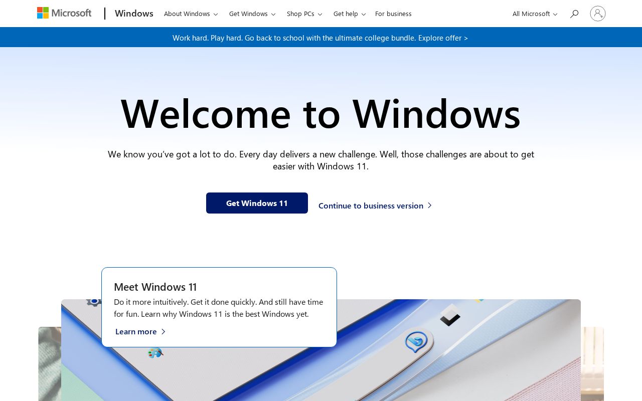
The hero text reads: "Welcome to Windows". Lacks action verbs. The hero does not describe what the product actually does, just makes a vague claim. The language is generic — a visitor can't tell what the product does from the headline alone. With a clarity score of 72, Windows is above the overall median of 36.
The page has 12 CTAs, 3 of them above the fold. That's enough to trigger decision paralysis — when too many buttons compete for attention, visitors often click none. The primary CTA "Start now" is a value-oriented CTA — it promises a benefit, not just an action.
Audience targeting is crystal clear — the homepage makes it obvious who this is for. Detected audience: small business, B2B SaaS, developer and student. Role words found: "developer", "student", "team". ICP clarity score: 79 (above the median of 35).
Windows fits the "Platform / Ecosystem" archetype with moderate confidence. This means the homepage is positioning as a platform others build on — emphasizing integrations, extensibility, and ecosystem over a single feature.
The biggest opportunities for Windows: First impression clarity is below median — visitors can't quickly tell what category this product falls into.
Hero Text
homepagerankings.com

"Welcome to Windows"
Word count
3 words
Specificity
generic
Lacks action verbs. The hero does not describe what the product actually does, just makes a vague claim.
Subhead
"Choose a Windows PC"
Calls to Action (12 found)
homepagerankings.com
Positioning: Platform / Ecosystem
The homepage positions the product as a platform others build on. The messaging emphasizes integrations, extensibility, APIs, and ecosystem, not a single feature. This archetype works when the product genuinely connects to other tools, but can feel hollow when applied to simple single-purpose products.
Audience Targeting
Specificity
crystal-clear
Detected audience
small business, B2B SaaS, developer and student
Recommendations
- Your ICP definition is strong. Consider testing whether narrowing further (e.g., adding company stage or specific pain point) improves conversion.
First Impression
A visitor would think this is a b2b saas for someone that offers app.
Pricing Page
No pricing page detected. For most companies, this creates friction. Visitors who can't find pricing assume they can't afford it.
Get the same analysis for your site
Grade Your HomepageWant a team to help fix this?
Work with us