Vimeo Marketing Teardown
A deep-dive analysis of vimeo.com's homepage messaging, scored 75/100 (B).
75/100
16 points above the median of 59
Scorecard
Analysis
Vimeo scores 75 out of 100 on homepage messaging, earning a B grade — good messaging with some areas to tighten up. Across all 30,134 sites analyzed, that's above the median of 59. Within B2C SaaS / Consumer App, where the median is 64, Vimeo lands 11 points above the industry average.
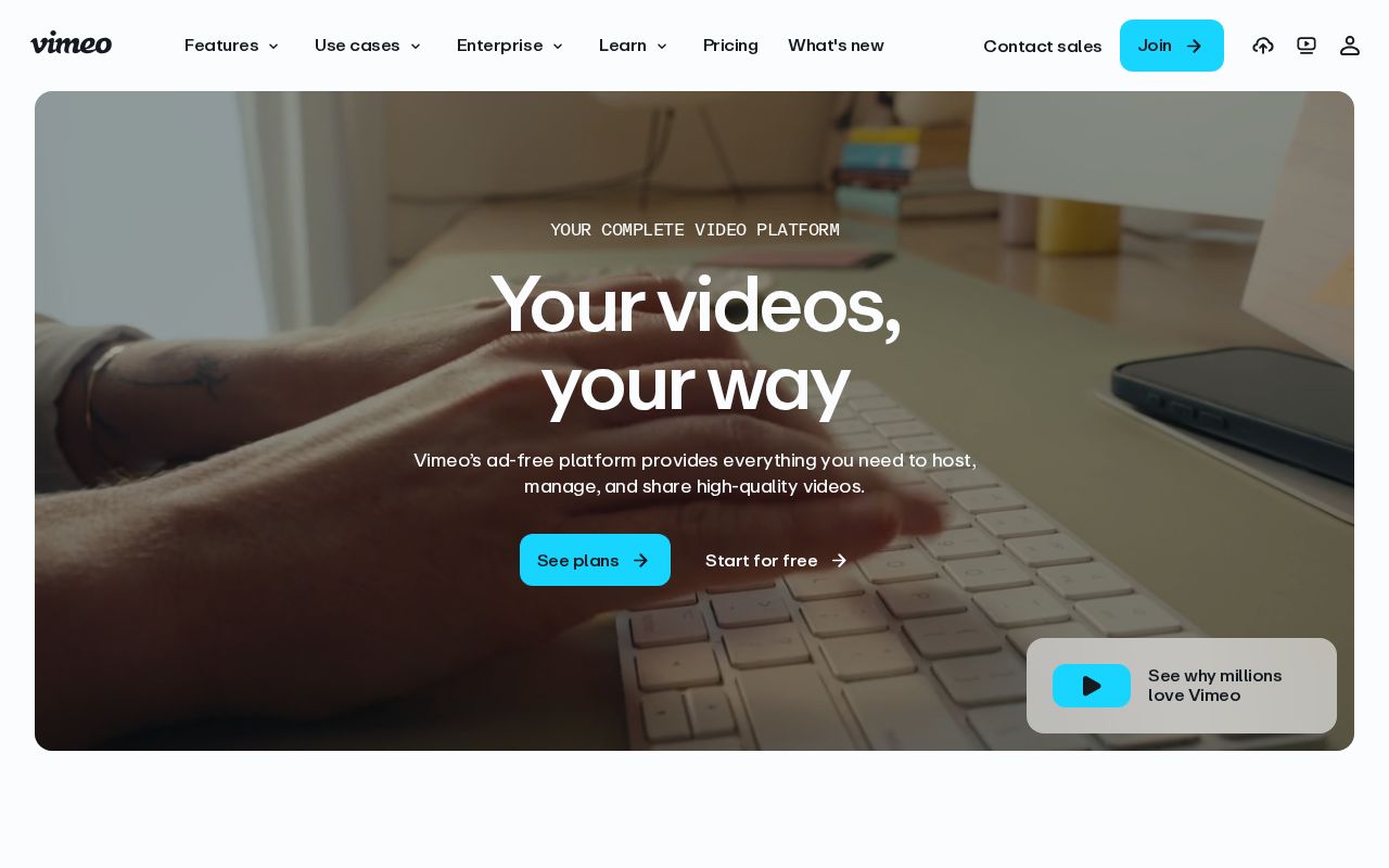
The hero text reads: "Your complete video platform". Lacks action verbs. The hero does not describe what the product actually does, just makes a vague claim. The language is generic — a visitor can't tell what the product does from the headline alone. With a clarity score of 72, Vimeo is above the overall median of 36.
The page has 13 CTAs, 4 of them above the fold. That's enough to trigger decision paralysis — when too many buttons compete for attention, visitors often click none. The primary CTA "Start for free" is a value-oriented CTA — it promises a benefit, not just an action.
Audience targeting is unclear. Detected audience: B2B SaaS. ICP clarity score: 15 (below the median of 35).
Vimeo fits the "Platform / Ecosystem" archetype with high confidence. This means the homepage is positioning as a platform others build on — emphasizing integrations, extensibility, and ecosystem over a single feature.
On the pricing page: Vimeo has a free tier, an annual billing toggle, a feature comparison table, and social proof elements. 8 tiers is a lot — the sweet spot is 2–4, otherwise buyers get overwhelmed comparing options. Show actual prices on your pricing page. Hidden pricing creates friction and drives visitors away.
Even at a B grade, there's room to improve. Audience targeting is weak — adding a "for [specific role/company type]" pattern would sharpen the positioning immediately.
Hero Text
homepagerankings.com

"Your complete video platform"
Word count
4 words
Specificity
generic
Lacks action verbs. The hero does not describe what the product actually does, just makes a vague claim.
Subhead
"Your videos, your way"
Calls to Action (13 found)
homepagerankings.com

Positioning: Platform / Ecosystem
The homepage positions the product as a platform others build on. The messaging emphasizes integrations, extensibility, APIs, and ecosystem, not a single feature. This archetype works when the product genuinely connects to other tools, but can feel hollow when applied to simple single-purpose products.
Audience Targeting
Specificity
generic
Detected audience
B2B SaaS
Recommendations
- Your page lacks role-specific language. Name your user directly: 'for engineering managers,' 'for freelance designers,' etc. The more specific, the more it resonates.
- Add a company size or type indicator. 'For startups,' 'for enterprise teams,' or 'for agencies' helps visitors self-select instantly.
- Swap vague audience language ('for businesses,' 'for teams') with a specific segment. If you sell to everyone, your messaging sells to no one.
First Impression
A visitor would think this is a b2b saas for someone that offers platform that manages.
Pricing Page
Tiers
8
Free tier
Yes
Score
80/100
- Show actual prices on your pricing page. Hidden pricing creates friction and drives visitors away.
- Too many tiers create decision fatigue. Aim for 2-4 tiers with clear differentiation.
- Add a FAQ section to your pricing page. It addresses objections and reduces support load.
Get the same analysis for your site
Grade Your HomepageWant a team to help fix this?
Work with us