Vanta Marketing Teardown
A deep-dive analysis of vanta.com's homepage messaging, scored 84/100 (A+).
Good button, vague headline. A visitor has to guess what it does.
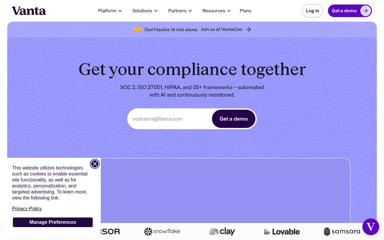
First screen at 1280px wide.
What we noticed
- 1
The headline doesn’t say what Vanta does.
“Get your compliance together” could sit on a lot of homepages. A first-time visitor still has to guess what you sell.
Try: Say what it is and who it’s for, in plain words, in the headline itself.
- 2
Good button.
“Get a demo” says what you get. Keep it.
- 3
There’s proof near the top.
It shows a “trusted by” line early, so visitors know other people already use it.
- 4
It’s clear who it’s for.
The copy names its audience, so the right visitors recognize themselves quickly.
84/100
A+24 points above the median of 60
Scorecard
Analysis
Vanta scores 84 out of 100, an A+. A first-time visitor can tell what this is, who it's for and why it matters. That puts it in the top 10% of the 30,521 homepages we've ranked, where the median is 60. Among B2B SaaS sites, where the median is 73, it's 11 points ahead.
The headline reads "Get your compliance together". The headline makes a broad claim without saying what the product actually does. Its clarity score of 62 is above the overall median of 39.
The page has 8 CTAs, 5 of them above the fold. The main button, "Get a demo", promises a benefit rather than just an action. Its CTA score is 75, above the median of 45.
The homepage makes it obvious who this is for. Detected audience: startup / enterprise, B2B SaaS, engineer and founder. It uses a "for [audience]" line: "TPRM". Its ICP score is 95, above the median of 35.
Vanta fits the "Community / Movement" archetype with moderate confidence. The homepage is rallying people around a mission or identity, not just a product.
The pricing page has an annual billing toggle and social proof elements. 6 tiers is a lot. Two to four is the sweet spot, and past that buyers get stuck comparing options. Show actual prices on your pricing page. Hidden pricing creates friction and drives visitors away.
Hero Text
"Get your compliance together"
Word count
4 words
Specificity
generic
The headline makes a broad claim without saying what the product actually does.
Subhead
"SOC 2, ISO 27001, HIPAA, and 35+ frameworks—automated with AI and continuously monitored."
Calls to Action (8 found)
Positioning: Community / Movement
The messaging rallies users around a mission or identity, not just a product. This archetype works well for open-source projects, social platforms, and mission-driven companies. The risk is sounding more like a manifesto than a product page.
Audience Targeting
Specificity
crystal-clear
Detected audience
startup / enterprise, B2B SaaS, engineer and founder
"For X" pattern
"TPRM"
Recommendations
- Your ICP definition is strong. Consider testing whether narrowing further (e.g., adding company stage or specific pain point) improves conversion.
First Impression
A visitor would think this is a b2b saas for someone that offers framework that automates.
Pricing Page
Tiers
6
Free tier
No
Score
65/100
- Show actual prices on your pricing page. Hidden pricing creates friction and drives visitors away.
- Too many tiers create decision fatigue. Aim for 2-4 tiers with clear differentiation.
- Consider adding a free tier or free trial. It reduces friction and lets prospects experience your product before paying.
- Add a FAQ section to your pricing page. It addresses objections and reduces support load.
- Add a feature comparison table. It helps visitors understand the differences between tiers at a glance.
Want a human to tear down vanta.com?
Each week Alex Stonehouse of Brilliantly Wrong records five free video teardowns for sites that ask. Each one covers what a first-time buyer takes away and the three fixes that matter most.
Compare Vanta
Get the same analysis for your site
Grade Your HomepageWant a team to help fix this?
Work with us