Shield Marketing Teardown
A deep-dive analysis of shield.ai's homepage messaging, scored 66/100 (B-).
No clear headline and weak main button. A visitor has to work out what it is on their own.
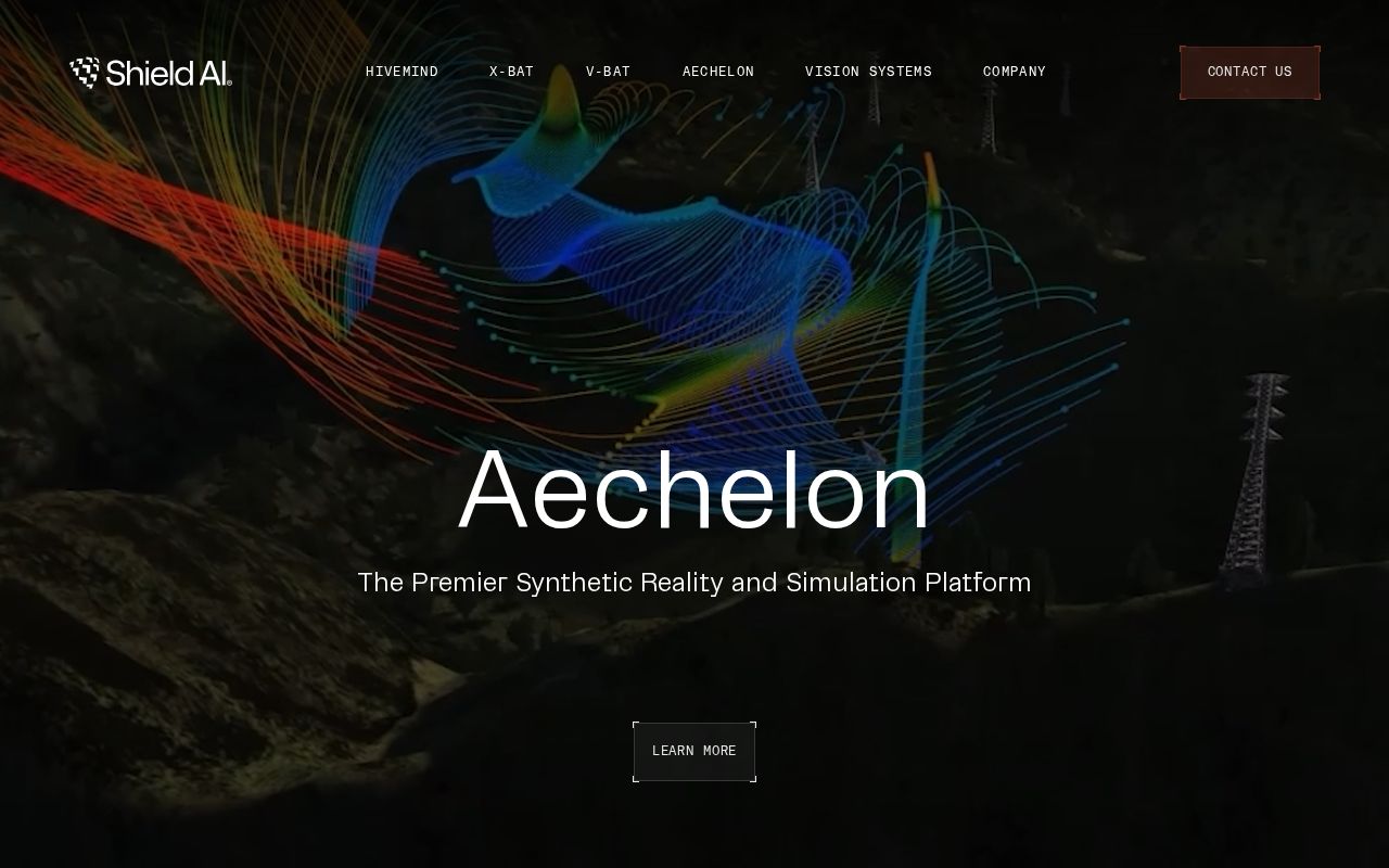
First screen at 1280px wide.
What we noticed
- 1
The headline is just “Aechelon”.
A word or two can name something, but it can’t say what it is or who it’s for.
Try: Open with one plain sentence: what Shield is and who it’s for.
- 2
The main button is “Learn More”.
It asks for a click without saying what happens next.
Try: Name what they get: a demo, a quote, a free trial, a price.
- 3
Nothing near the top says anyone else uses it.
No customer logos, numbers or quotes show up near the headline.
Try: Add a short proof line under the buttons: a customer count, a few logos or one real quote.
66/100
B-6 points above the median of 60
Scorecard
Analysis
Shield scores 66 out of 100, a B-. The core message lands, but a few parts make visitors work harder than they should. That puts it in the upper half of the 30,521 homepages we've ranked, where the median is 60. That's in line with the Defense & GovTech median of 63.
The headline reads "Aechelon". The headline makes a broad claim without saying what the product actually does. Its clarity score of 59 is above the overall median of 39.
The page has 4 CTAs, 4 of them above the fold. The main button, "Learn More", falls in the "Passive" tier.
There are signals about who this is for, but the audience could be sharper. Detected audience: Defense & GovTech, operator.
Shield fits the "Community / Movement" archetype with high confidence. The homepage is rallying people around a mission or identity, not just a product.
Here's where Shield has the most to gain. The copy leans on overused buzzwords ("next-generation") that water down the message. The CTAs are weaker than most. Button text that names an outcome ("Start free trial") beats generic text ("Learn more").
Hero Text
"Aechelon"
Word count
1 words
Specificity
generic
The headline makes a broad claim without saying what the product actually does.
Subhead
"The Premier Synthetic Reality and Simulation Platform"
Calls to Action (4 found)
Positioning: Community / Movement
The messaging rallies users around a mission or identity, not just a product. This archetype works well for open-source projects, social platforms, and mission-driven companies. The risk is sounding more like a manifesto than a product page.
Audience Targeting
Specificity
decent
Detected audience
Defense & GovTech, operator
Recommendations
- You have audience signals scattered in your copy, but no explicit 'for [audience]' statement. Adding one in the hero or subhead makes it immediately clear.
- You mention roles but not company types. Adding 'at [company type]' helps narrow the ICP further. 'For marketers at B2B SaaS companies' is much sharper than just 'for marketers.'
First Impression
A visitor would think this is a defense & govtech for someone that offers something that builds.
Pricing Page
No pricing page detected. For most companies, this creates friction. Visitors who can't find pricing assume they can't afford it.
Want a human to tear down shield.ai?
Each week Alex Stonehouse of Brilliantly Wrong records five free video teardowns for sites that ask. Each one covers what a first-time buyer takes away and the three fixes that matter most.
Get the same analysis for your site
Grade Your HomepageWant a team to help fix this?
Work with us