Opera Marketing Teardown
A deep-dive analysis of opera.com's homepage messaging, scored 67/100 (B).
67/100
8 points above the median of 59
Scorecard
Analysis
Opera scores 67 out of 100 on homepage messaging, earning a B grade — good messaging with some areas to tighten up. Across all 30,134 sites analyzed, that's above the median of 59. Within Media / Content / Publishing, where the median is 62, Opera lands 5 points above the industry average.
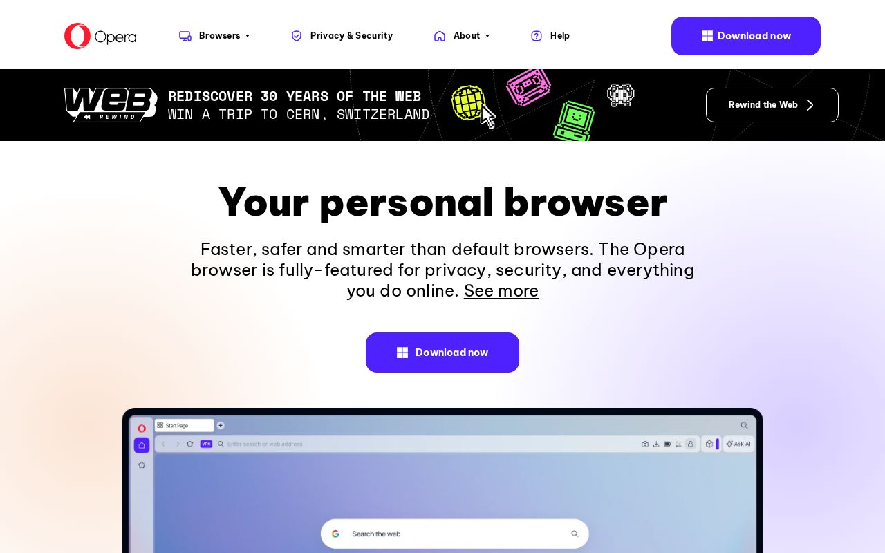
The hero text reads: "Your personal browser". Lacks action verbs. The hero does not describe what the product actually does, just makes a vague claim. The language is generic — a visitor can't tell what the product does from the headline alone. With a clarity score of 53, Opera is above the overall median of 36.
The page has 7 CTAs, 6 of them above the fold. That's enough to trigger decision paralysis — when too many buttons compete for attention, visitors often click none. The primary CTA "Chat with Opera AI for free" is generic — 'Learn more' and 'Get started' don't tell visitors what happens next. CTA effectiveness score: 47 (below the median of 57).
Audience targeting is decent — there are audience signals, but room to be more specific. Detected audience: B2C SaaS / Consumer App. The site uses a "for [X]" pattern: "privacy". ICP clarity score: 45 (above the median of 35).
Opera fits the "Price / Value Leader" archetype with high confidence.
The biggest opportunities for Opera: CTAs are causing decision paralysis — reduce to one primary action above the fold.
Hero Text
homepagerankings.com
"Your personal browser"
Word count
3 words
Specificity
generic
Lacks action verbs. The hero does not describe what the product actually does, just makes a vague claim.
Calls to Action (7 found)
homepagerankings.com
Positioning: Price / Value Leader
Audience Targeting
Specificity
decent
Detected audience
B2C SaaS / Consumer App
"For X" pattern
"privacy"
Recommendations
- Add a pain point that your audience relates to. 'Tired of [specific frustration]?' or 'Stop wasting time on [tedious task]' makes your ICP feel seen.
First Impression
A visitor would think this is a b2c saas / consumer app for privacy that offers something unclear.
Pricing Page
No pricing page detected. For most companies, this creates friction. Visitors who can't find pricing assume they can't afford it.
Get the same analysis for your site
Grade Your HomepageWant a team to help fix this?
Work with us