Nginx Marketing Teardown
A deep-dive analysis of nginx.com's homepage messaging, scored 62/100 (C).
62/100
3 points above the median of 59
Scorecard
Analysis
Nginx scores 62 out of 100 on homepage messaging, earning a C grade — average — basic messaging is present but generic. Across all 30,134 sites analyzed, that's close to the median of 59.
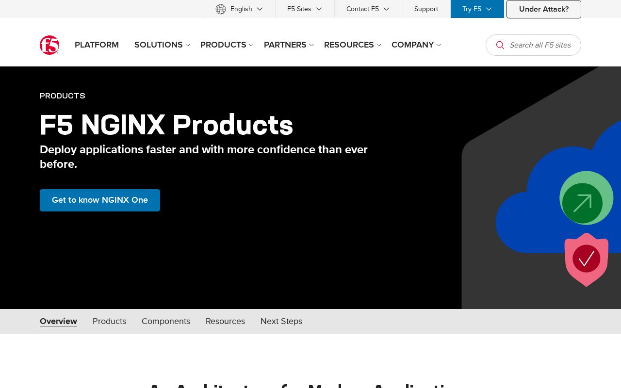
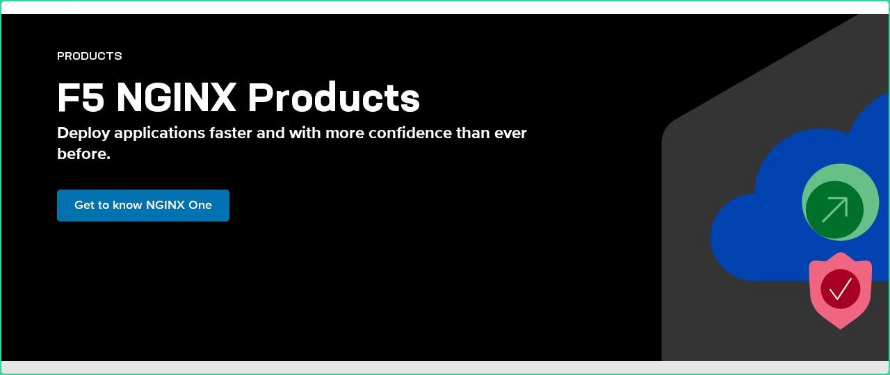
The hero text reads: "F5 NGINX Products". Lacks action verbs. The hero does not describe what the product actually does, just makes a vague claim. The language is generic — a visitor can't tell what the product does from the headline alone.
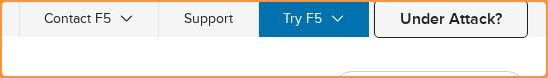
The page has 15 CTAs, 4 of them above the fold. That's enough to trigger decision paralysis — when too many buttons compete for attention, visitors often click none. The primary CTA "Try NGINX for free" is generic — 'Learn more' and 'Get started' don't tell visitors what happens next. CTA effectiveness score: 40 (below the median of 57).
Audience targeting is unclear. Detected audience: Developer Tools / Infrastructure. ICP clarity score: 15 (below the median of 35).
Nginx fits the "Premium / Quality Leader" archetype with moderate confidence. This means the homepage is leading with craft and quality signals — the positioning says 'you get what you pay for'.
On the pricing page: Nginx has a free tier and a feature comparison table. 5 tiers is a lot — the sweet spot is 2–4, otherwise buyers get overwhelmed comparing options. Show actual prices on your pricing page. Hidden pricing creates friction and drives visitors away.
The biggest opportunities for Nginx: Audience targeting is weak — adding a "for [specific role/company type]" pattern would sharpen the positioning immediately. CTAs are causing decision paralysis — reduce to one primary action above the fold. Clarity is 6 points below median — the hero text needs to say what the product does in plain language.
Hero Text
homepagerankings.com
"F5 NGINX Products"
Word count
3 words
Specificity
generic
Lacks action verbs. The hero does not describe what the product actually does, just makes a vague claim.
Subhead
"Deploy applications faster and with more confidence than ever before."
Calls to Action (15 found)
homepagerankings.com
Positioning: Premium / Quality Leader
The homepage leads with craft, quality, and polish. 'You get what you pay for' is the underlying message. Works when the product genuinely delivers a premium experience, but can backfire if the actual product doesn't match the marketing's tone.
Audience Targeting
Specificity
generic
Detected audience
Developer Tools / Infrastructure
Recommendations
- Your page lacks role-specific language. Name your user directly: 'for engineering managers,' 'for freelance designers,' etc. The more specific, the more it resonates.
- Add a company size or type indicator. 'For startups,' 'for enterprise teams,' or 'for agencies' helps visitors self-select instantly.
- Swap vague audience language ('for businesses,' 'for teams') with a specific segment. If you sell to everyone, your messaging sells to no one.
First Impression
A visitor would think this is a developer tools / infrastructure for someone that offers something that deploys.
Pricing Page
Tiers
5
Free tier
Yes
Score
75/100
- Show actual prices on your pricing page. Hidden pricing creates friction and drives visitors away.
- Add a FAQ section to your pricing page. It addresses objections and reduces support load.
- Add social proof to your pricing page. Logos, testimonials, or customer counts reassure buyers at the decision point.
Get the same analysis for your site
Grade Your HomepageWant a team to help fix this?
Work with us