Mozilla Marketing Teardown
A deep-dive analysis of mozilla.org's homepage messaging, scored 64/100 (C+).
64/100
5 points above the median of 59
Scorecard
Analysis
Mozilla scores 64 out of 100 on homepage messaging, earning a C+ grade — mixed. Across all 30,134 sites analyzed, that's above the median of 59.
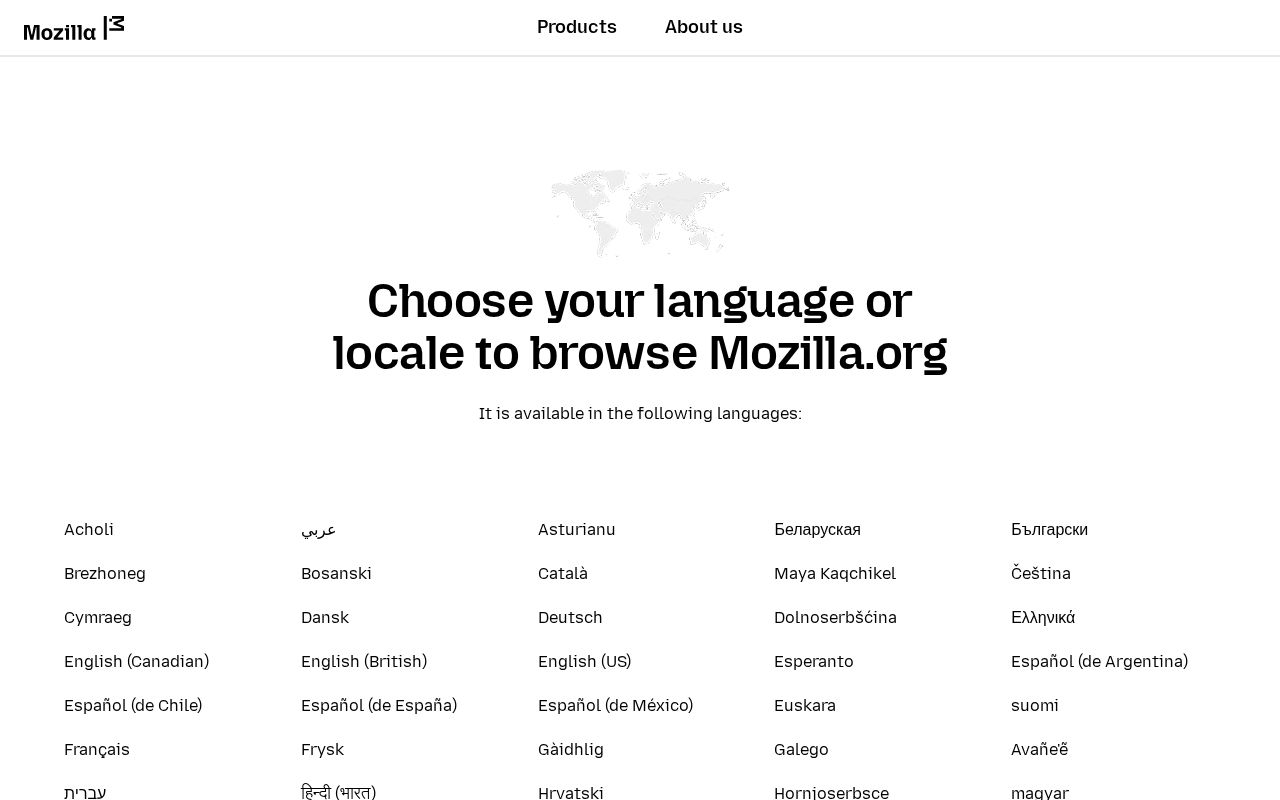
The hero text reads: "Choose your language or locale to browse Mozilla.org". Lacks action verbs. The hero does not describe what the product actually does, just makes a vague claim. The language is generic — a visitor can't tell what the product does from the headline alone.
The page has 2 CTAs. That's a focused set, which avoids overwhelming visitors. The primary CTA "Contact" is generic — 'Learn more' and 'Get started' don't tell visitors what happens next.
Audience targeting is decent — there are audience signals, but room to be more specific. Detected audience: Nonprofit / NGO. The site uses a "for [X]" pattern: "people". ICP clarity score: 45 (above the median of 35).
Mozilla fits the "Community / Movement" archetype with moderate confidence. This means the homepage is rallying users around a mission or identity, not just a product.
Hero Text
homepagerankings.com

"Choose your language or locale to browse Mozilla.org"
Word count
8 words
Specificity
generic
Lacks action verbs. The hero does not describe what the product actually does, just makes a vague claim.
Subhead
"It is available in the following languages:"
Calls to Action (2 found)

Positioning: Community / Movement
The messaging rallies users around a mission or identity, not just a product. This archetype works well for open-source projects, social platforms, and mission-driven companies. The risk is sounding more like a manifesto than a product page.
Audience Targeting
Specificity
decent
Detected audience
Nonprofit / NGO
"For X" pattern
"people"
Recommendations
- Add a pain point that your audience relates to. 'Tired of [specific frustration]?' or 'Stop wasting time on [tedious task]' makes your ICP feel seen.
First Impression
A visitor would think this is a b2b saas for people that offers something unclear.
Pricing Page
No pricing page detected. For most companies, this creates friction. Visitors who can't find pricing assume they can't afford it.
Get the same analysis for your site
Grade Your HomepageWant a team to help fix this?
Work with us