Github Marketing Teardown
A deep-dive analysis of github.com's homepage messaging, scored 83/100 (A+).
83/100
24 points above the median of 59
Scorecard
Analysis
Github scores 83 out of 100 on homepage messaging, earning a A+ grade — mixed. Across all 30,134 sites analyzed, that's well above the median of 59. Within Developer Tools / Infrastructure, where the median is 60, Github lands 23 points above the industry average.
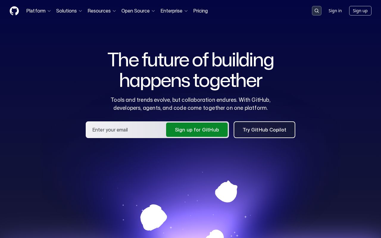
The hero text reads: "Search code, repositories, users, issues, pull requests...". Decent. Action verbs give a sense of function, but could be more explicit about exactly what the product is. The language is specific enough that visitors get a concrete sense of what's offered. With a clarity score of 100, Github is above the overall median of 36.
The page has 10 CTAs, 4 of them above the fold. That's enough to trigger decision paralysis — when too many buttons compete for attention, visitors often click none. The primary CTA "Secret protectionStop leaks before they start" is a value-oriented CTA — it promises a benefit, not just an action.
Audience targeting is decent — there are audience signals, but room to be more specific. Detected audience: B2B SaaS, developer. Role words found: "developer". The site uses a "for [X]" pattern: "BusinessEnterprise". ICP clarity score: 53 (above the median of 35).
Github fits the "Community / Movement" archetype with high confidence. This means the homepage is rallying users around a mission or identity, not just a product.
On the pricing page: Github has a free tier, an annual billing toggle, and a feature comparison table. 2 pricing tiers is a solid structure. Show actual prices on your pricing page. Hidden pricing creates friction and drives visitors away.
Hero Text
homepagerankings.com

"Search code, repositories, users, issues, pull requests..."
Word count
7 words
Specificity
specific
Decent. Action verbs give a sense of function, but could be more explicit about exactly what the product is.
Subhead
"Navigation Menu"
Calls to Action (10 found)
homepagerankings.com
Positioning: Community / Movement
The messaging rallies users around a mission or identity, not just a product. This archetype works well for open-source projects, social platforms, and mission-driven companies. The risk is sounding more like a manifesto than a product page.
Audience Targeting
Specificity
decent
Detected audience
B2B SaaS, developer
"For X" pattern
"BusinessEnterprise"
Recommendations
- You mention roles but not company types. Adding 'at [company type]' helps narrow the ICP further. 'For marketers at B2B SaaS companies' is much sharper than just 'for marketers.'
- Add a pain point that your audience relates to. 'Tired of [specific frustration]?' or 'Stop wasting time on [tedious task]' makes your ICP feel seen.
First Impression
A visitor would think this is a b2b saas for someone that offers something that analyzes.
Pricing Page
Tiers
2
Free tier
Yes
Score
90/100
- Show actual prices on your pricing page. Hidden pricing creates friction and drives visitors away.
- Add a FAQ section to your pricing page. It addresses objections and reduces support load.
- Add social proof to your pricing page. Logos, testimonials, or customer counts reassure buyers at the decision point.
Compare Github
Get the same analysis for your site
Grade Your HomepageWant a team to help fix this?
Work with us