Cloudflare Marketing Teardown
A deep-dive analysis of cloudflare.net's homepage messaging, scored 62/100 (C).
62/100
3 points above the median of 59
Scorecard
Analysis
Cloudflare scores 62 out of 100 on homepage messaging, earning a C grade — average — basic messaging is present but generic. Across all 30,134 sites analyzed, that's close to the median of 59.
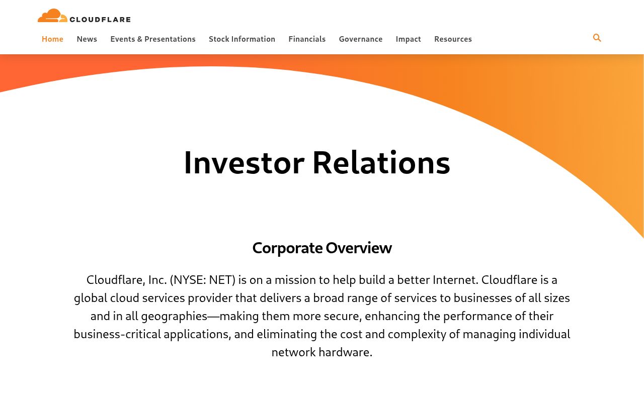
The hero text reads: "Investor Relations". Lacks action verbs. The hero does not describe what the product actually does, just makes a vague claim. The language is generic — a visitor can't tell what the product does from the headline alone. With a clarity score of 52, Cloudflare is above the overall median of 36.
The page has 3 CTAs, 1 of them above the fold. That's a focused set, which avoids overwhelming visitors. The primary CTA "Industry Analysts" is generic — 'Learn more' and 'Get started' don't tell visitors what happens next.
Audience targeting is decent — there are audience signals, but room to be more specific. Detected audience: Fortune 500, Nonprofit / NGO. The site uses a "for [X]" pattern: "investor email alerts". ICP clarity score: 53 (above the median of 35).
Cloudflare fits the "Community / Movement" archetype with moderate confidence. This means the homepage is rallying users around a mission or identity, not just a product.
On the pricing page: Cloudflare has an annual billing toggle and social proof elements. 5 tiers is a lot — the sweet spot is 2–4, otherwise buyers get overwhelmed comparing options. Show actual prices on your pricing page. Hidden pricing creates friction and drives visitors away.
The biggest opportunities for Cloudflare: First impression clarity is below median — visitors can't quickly tell what category this product falls into.
Hero Text
homepagerankings.com
"Investor Relations"
Word count
2 words
Specificity
generic
Lacks action verbs. The hero does not describe what the product actually does, just makes a vague claim.
Calls to Action (3 found)

Positioning: Community / Movement
The messaging rallies users around a mission or identity, not just a product. This archetype works well for open-source projects, social platforms, and mission-driven companies. The risk is sounding more like a manifesto than a product page.
Audience Targeting
Specificity
decent
Detected audience
Fortune 500, Nonprofit / NGO
"For X" pattern
"investor email alerts"
Recommendations
- You describe the company type but not the person using it. Name the role: 'for CTOs at enterprise companies' is more compelling than just 'for enterprise.'
- Add a pain point that your audience relates to. 'Tired of [specific frustration]?' or 'Stop wasting time on [tedious task]' makes your ICP feel seen.
First Impression
A visitor would think this is a b2b saas for someone that offers something unclear.
Pricing Page
Tiers
5
Free tier
No
Score
75/100
- Show actual prices on your pricing page. Hidden pricing creates friction and drives visitors away.
- Consider adding a free tier or free trial. It reduces friction and lets prospects experience your product before paying.
- Add a FAQ section to your pricing page. It addresses objections and reduces support load.
- Add a feature comparison table. It helps visitors understand the differences between tiers at a glance.
Get the same analysis for your site
Grade Your HomepageWant a team to help fix this?
Work with us