Cloud.microsoft Marketing Teardown
A deep-dive analysis of cloud.microsoft's homepage messaging, scored 70/100 (B-).
70/100
11 points above the median of 59
Scorecard
Analysis
Cloud.microsoft scores 70 out of 100 on homepage messaging, earning a B- grade — mixed. Across all 30,134 sites analyzed, that's above the median of 59. Within B2C SaaS / Consumer App, where the median is 64, Cloud.microsoft lands 6 points above the industry average.
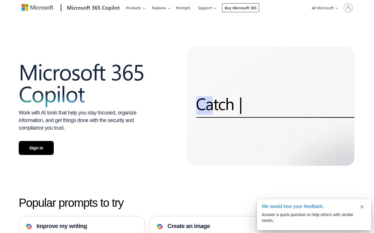
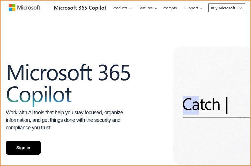
The hero text reads: "Meet the Microsoft 365 Copilot app". Lacks action verbs. The hero does not describe what the product actually does, just makes a vague claim. The language is generic — a visitor can't tell what the product does from the headline alone. With a clarity score of 72, Cloud.microsoft is above the overall median of 36.
The page has 12 CTAs, 6 of them above the fold. That's enough to trigger decision paralysis — when too many buttons compete for attention, visitors often click none. The primary CTA "Contact Sales" is generic — 'Learn more' and 'Get started' don't tell visitors what happens next. CTA effectiveness score: 42 (below the median of 57).
Audience targeting is crystal clear — the homepage makes it obvious who this is for. Detected audience: enterprise / small business, B2B SaaS, student and team. Role words found: "student", "team". ICP clarity score: 80 (above the median of 35).
Cloud.microsoft fits the "Community / Movement" archetype with moderate confidence. This means the homepage is rallying users around a mission or identity, not just a product.
On the pricing page: Cloud.microsoft has a free tier and an FAQ section. 7 tiers is a lot — the sweet spot is 2–4, otherwise buyers get overwhelmed comparing options. Show actual prices on your pricing page. Hidden pricing creates friction and drives visitors away.
Even at a B- grade, there's room to improve. CTAs are causing decision paralysis — reduce to one primary action above the fold.
Hero Text
homepagerankings.com
"Meet the Microsoft 365 Copilot app"
Word count
6 words
Specificity
generic
Lacks action verbs. The hero does not describe what the product actually does, just makes a vague claim.
Subhead
"Work with AI tools that help you stay focused, organize information, and get things done with the security and compliance you trust."
Calls to Action (12 found)
homepagerankings.com
Positioning: Community / Movement
The messaging rallies users around a mission or identity, not just a product. This archetype works well for open-source projects, social platforms, and mission-driven companies. The risk is sounding more like a manifesto than a product page.
Audience Targeting
Specificity
crystal-clear
Detected audience
enterprise / small business, B2B SaaS, student and team
Recommendations
- Your ICP definition is strong. Consider testing whether narrowing further (e.g., adding company stage or specific pain point) improves conversion.
First Impression
A visitor would think this is a b2b saas for someone that offers tool that creates.
Pricing Page
Tiers
7
Free tier
Yes
Score
65/100
- Show actual prices on your pricing page. Hidden pricing creates friction and drives visitors away.
- Too many tiers create decision fatigue. Aim for 2-4 tiers with clear differentiation.
- Add social proof to your pricing page. Logos, testimonials, or customer counts reassure buyers at the decision point.
- Add a feature comparison table. It helps visitors understand the differences between tiers at a glance.
Get the same analysis for your site
Grade Your HomepageWant a team to help fix this?
Work with us