Bit.ly Marketing Teardown
A deep-dive analysis of bit.ly's homepage messaging, scored 58/100 (C+).
58/100
1 points below the median of 59
Scorecard
Analysis
Bit.ly scores 58 out of 100 on homepage messaging, earning a C+ grade — mixed. Across all 30,134 sites analyzed, that's close to the median of 59.
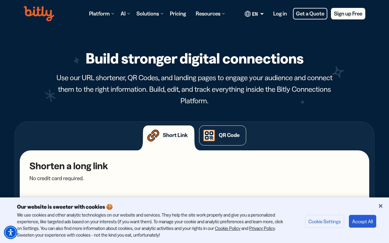
The hero text reads: "Here's a preview of your destination". Lacks action verbs. The hero does not describe what the product actually does, just makes a vague claim. The language is generic — a visitor can't tell what the product does from the headline alone. With a clarity score of 26, Bit.ly is below the overall median of 36.
Bit.ly has no detectable call-to-action buttons on the homepage — a missed opportunity to direct visitor attention.
Audience targeting is decent — there are audience signals, but room to be more specific. Detected audience: everyone. The site uses a "for [X]" pattern: "everyone".
The biggest opportunities for Bit.ly: CTA effectiveness is below median — consider using action-oriented language ("Start free trial") over generic buttons ("Learn more"). First impression clarity is below median — visitors can't quickly tell what category this product falls into. Clarity is 10 points below median — the hero text needs to say what the product does in plain language.
Hero Text

"Here's a preview of your destination"
Word count
6 words
Specificity
generic
Lacks action verbs. The hero does not describe what the product actually does, just makes a vague claim.
Subhead
"Destination:"
Calls to Action (0 found)
homepagerankings.com
Audience Targeting
Specificity
decent
Detected audience
everyone
"For X" pattern
"everyone"
Recommendations
- Add a pain point that your audience relates to. 'Tired of [specific frustration]?' or 'Stop wasting time on [tedious task]' makes your ICP feel seen.
First Impression
A visitor would think this is a some kind of company for someone that offers something unclear.
Pricing Page
No pricing page detected. For most companies, this creates friction. Visitors who can't find pricing assume they can't afford it.
Compare Bit.ly
Get the same analysis for your site
Grade Your HomepageWant a team to help fix this?
Work with us