B-cdn Marketing Teardown
A deep-dive analysis of b-cdn.net's homepage messaging, scored 74/100 (B+).
Proof up front, vague headline. A visitor has to guess what it does.
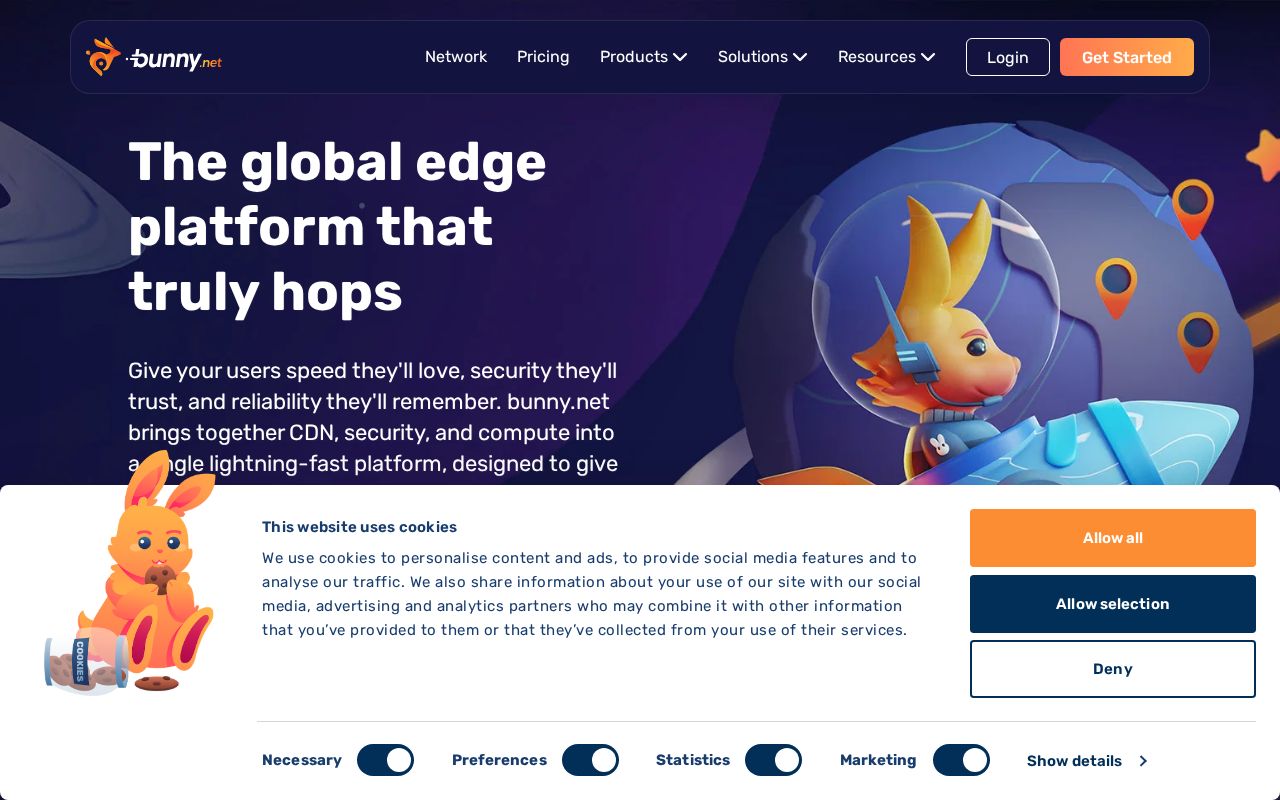
First screen at 1280px wide.
What we noticed
- 1
The headline doesn’t say what B-cdn does.
“The global edge platform that truly hops” could sit on a lot of homepages. A first-time visitor still has to guess what you sell.
Try: Say what it is and who it’s for, in plain words, in the headline itself.
- 2
There’s proof near the top.
It shows ratings early, so visitors know other people already use it.
74/100
B+14 points above the median of 60
Scorecard
Analysis
B-cdn scores 74 out of 100, a B+. The core message lands, but a few parts make visitors work harder than they should. That puts it in the top 10% of the 30,521 homepages we've ranked, where the median is 60. That's in line with the Developer Tools / Infrastructure median of 70.
The headline reads "The global edge platform that truly hops". The headline makes a broad claim without saying what the product actually does. Its clarity score of 56 is above the overall median of 39.
The page has 6 CTAs, 2 of them above the fold. The main button, "Try FREE for 14 Days", is generic and doesn't tell visitors what happens next. Its CTA score is 55, above the median of 45.
There are signals about who this is for, but the audience could be sharper. Detected audience: Developer Tools / Infrastructure. It uses a "for [audience]" line: "14 Days Get started in seconds". Its ICP score is 45, above the median of 35.
B-cdn fits the "Platform / Ecosystem" archetype with high confidence. The homepage is positioning itself as a platform others build on, stressing integrations and extensibility over any single feature.
The pricing page has a free tier and social proof elements. 5 tiers is a lot. Two to four is the sweet spot, and past that buyers get stuck comparing options. Add an annual billing option with visible savings. It increases upfront revenue and reduces churn.
Even with a B+, there's room to improve. The copy leans on overused buzzwords ("next-generation") that water down the message.
Hero Text
"The global edge platform that truly hops"
Word count
7 words
Specificity
generic
The headline makes a broad claim without saying what the product actually does.
Subhead
"Give your users speed they'll love, security they'll trust, and reliability they'll remember. bunny.net brings together CDN, security, and compute into a single lightning-fast platform, designed to give you the edge. Literally."
Calls to Action (6 found)
Positioning: Platform / Ecosystem
The homepage positions the product as a platform others build on. The messaging emphasizes integrations, extensibility, APIs, and ecosystem, not a single feature. This archetype works when the product genuinely connects to other tools, but can feel hollow when applied to simple single-purpose products.
Audience Targeting
Specificity
decent
Detected audience
Developer Tools / Infrastructure
"For X" pattern
"14 Days Get started in seconds"
First Impression
A visitor would think this is a developer tools / infrastructure for someone that offers platform that designs.
Pricing Page
Tiers
5
Free tier
Yes
Score
95/100
- Add an annual billing option with visible savings. It increases upfront revenue and reduces churn.
- Add a FAQ section to your pricing page. It addresses objections and reduces support load.
- Add a feature comparison table. It helps visitors understand the differences between tiers at a glance.
Want a human to tear down b-cdn.net?
Each week Alex Stonehouse of Brilliantly Wrong records five free video teardowns for sites that ask. Each one covers what a first-time buyer takes away and the three fixes that matter most.
Get the same analysis for your site
Grade Your HomepageWant a team to help fix this?
Work with us