Azure Marketing Teardown
A deep-dive analysis of azure.com's homepage messaging, scored 64/100 (C+).
64/100
5 points above the median of 59
Scorecard
Analysis
Azure scores 64 out of 100 on homepage messaging, earning a C+ grade — mixed. Across all 30,134 sites analyzed, that's above the median of 59.
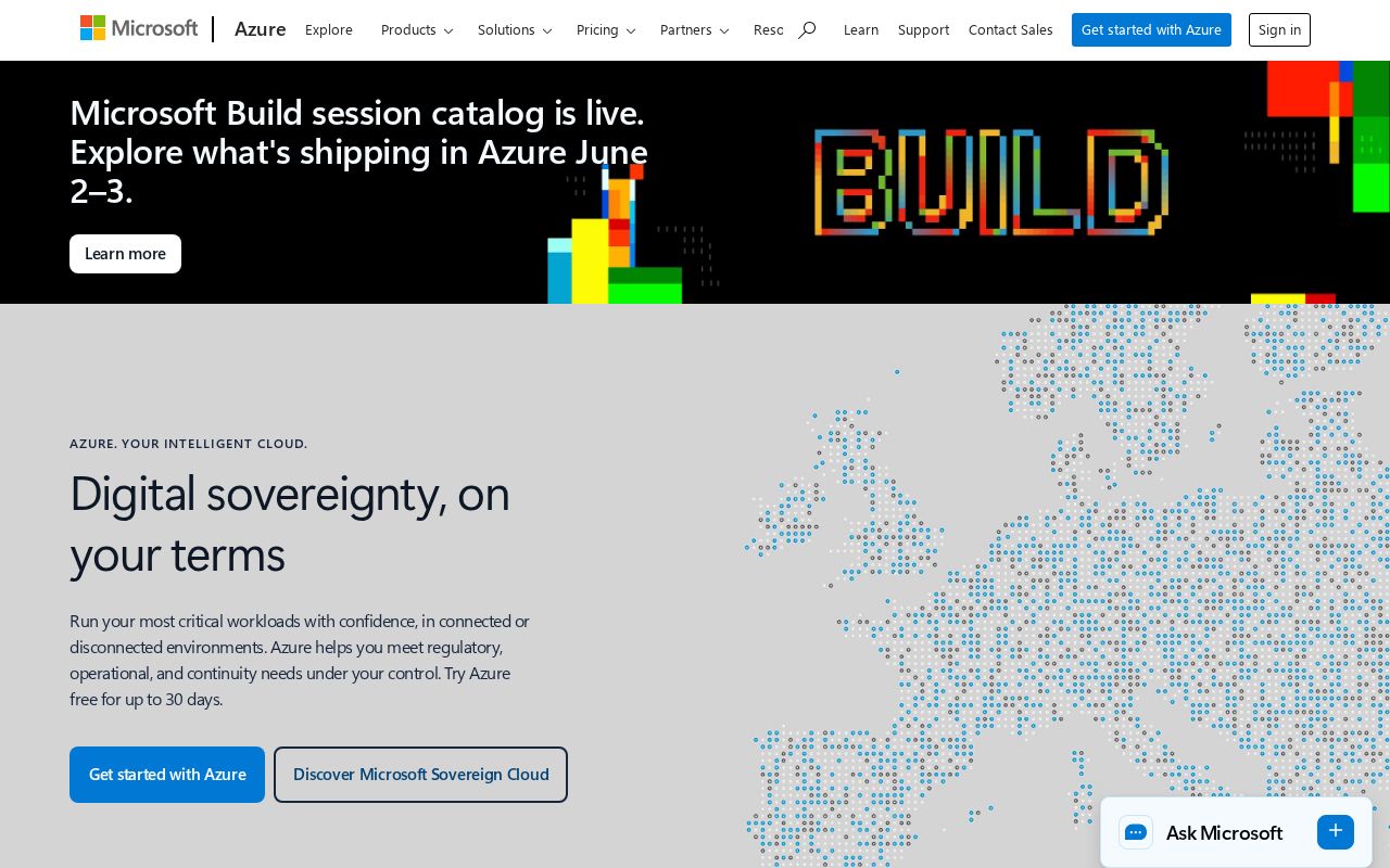
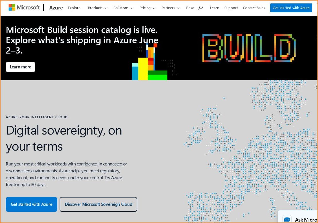
The hero text reads: "Digital sovereignty, on your terms". Lacks action verbs. The hero does not describe what the product actually does, just makes a vague claim. The language is generic — a visitor can't tell what the product does from the headline alone. With a clarity score of 59, Azure is above the overall median of 36.
The page has 19 CTAs, 1 of them above the fold. The primary CTA "Jump-start your career" is a value-oriented CTA — it promises a benefit, not just an action. CTA effectiveness score: 78 (above the median of 57).
Audience targeting is decent — there are audience signals, but room to be more specific. Detected audience: Developer Tools / Infrastructure, manager. Role words found: "manager". The site uses a "for [X]" pattern: "AI Azure AI Infrastruct". ICP clarity score: 50 (above the median of 35).
Azure fits the "Price / Value Leader" archetype with moderate confidence.
On the pricing page: Azure has a free tier and social proof elements. 6 tiers is a lot — the sweet spot is 2–4, otherwise buyers get overwhelmed comparing options. Show actual prices on your pricing page. Hidden pricing creates friction and drives visitors away.
Hero Text
homepagerankings.com
"Digital sovereignty, on your terms"
Word count
5 words
Specificity
generic
Lacks action verbs. The hero does not describe what the product actually does, just makes a vague claim.
Calls to Action (19 found)
homepagerankings.com
Positioning: Price / Value Leader
Audience Targeting
Specificity
decent
Detected audience
Developer Tools / Infrastructure, manager
"For X" pattern
"AI Azure AI Infrastruct"
Recommendations
- You mention roles but not company types. Adding 'at [company type]' helps narrow the ICP further. 'For marketers at B2B SaaS companies' is much sharper than just 'for marketers.'
- Add a pain point that your audience relates to. 'Tired of [specific frustration]?' or 'Stop wasting time on [tedious task]' makes your ICP feel seen.
First Impression
A visitor would think this is a developer tools / infrastructure for someone that offers platform.
Pricing Page
Tiers
6
Free tier
Yes
Score
70/100
- Show actual prices on your pricing page. Hidden pricing creates friction and drives visitors away.
- Too many tiers create decision fatigue. Aim for 2-4 tiers with clear differentiation.
- Add a FAQ section to your pricing page. It addresses objections and reduces support load.
- Add a feature comparison table. It helps visitors understand the differences between tiers at a glance.
Get the same analysis for your site
Grade Your HomepageWant a team to help fix this?
Work with us