Apple Marketing Teardown
A deep-dive analysis of apple.com's homepage messaging, scored 46/100 (D+).
46/100
13 points below the median of 59
Scorecard
Analysis
Apple scores 46 out of 100 on homepage messaging, earning a D+ grade — mixed. Across all 30,134 sites analyzed, that's below the median of 59. Within B2C SaaS / Consumer App, where the median is 64, Apple lands 18 points below the industry average.
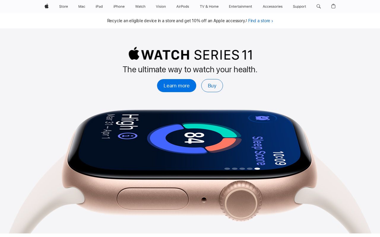
The hero text reads: "Apple". Lacks action verbs. The hero does not describe what the product actually does, just makes a vague claim. The language is generic — a visitor can't tell what the product does from the headline alone. With a clarity score of 52, Apple is above the overall median of 36.
The page has 7 CTAs, 4 of them above the fold. That's enough to trigger decision paralysis — when too many buttons compete for attention, visitors often click none. The primary CTA "Watch" is a value-oriented CTA — it promises a benefit, not just an action.
Audience targeting is unclear. Detected audience: developer. Role words found: "developer". ICP clarity score: 18 (below the median of 35).
Apple fits the "Community / Movement" archetype with moderate confidence. This means the homepage is rallying users around a mission or identity, not just a product.
The biggest opportunities for Apple: Audience targeting is weak — adding a "for [specific role/company type]" pattern would sharpen the positioning immediately. First impression clarity is below median — visitors can't quickly tell what category this product falls into.
Hero Text
homepagerankings.com
"Apple"
Word count
1 words
Specificity
generic
Lacks action verbs. The hero does not describe what the product actually does, just makes a vague claim.
Subhead
"iPhone"
Calls to Action (7 found)
homepagerankings.com

Positioning: Community / Movement
The messaging rallies users around a mission or identity, not just a product. This archetype works well for open-source projects, social platforms, and mission-driven companies. The risk is sounding more like a manifesto than a product page.
Audience Targeting
Specificity
generic
Detected audience
developer
Recommendations
- Add a company size or type indicator. 'For startups,' 'for enterprise teams,' or 'for agencies' helps visitors self-select instantly.
- Swap vague audience language ('for businesses,' 'for teams') with a specific segment. If you sell to everyone, your messaging sells to no one.
First Impression
A visitor would think this is a b2b saas for someone that offers app.
Pricing Page
No pricing page detected. For most companies, this creates friction. Visitors who can't find pricing assume they can't afford it.
Get the same analysis for your site
Grade Your HomepageWant a team to help fix this?
Work with us