Adobe Marketing Teardown
A deep-dive analysis of adobe.com's homepage messaging, scored 70/100 (B).
70/100
11 points above the median of 59
Scorecard
Analysis
Adobe scores 70 out of 100 on homepage messaging, earning a B grade — good messaging with some areas to tighten up. Across all 30,134 sites analyzed, that's above the median of 59.
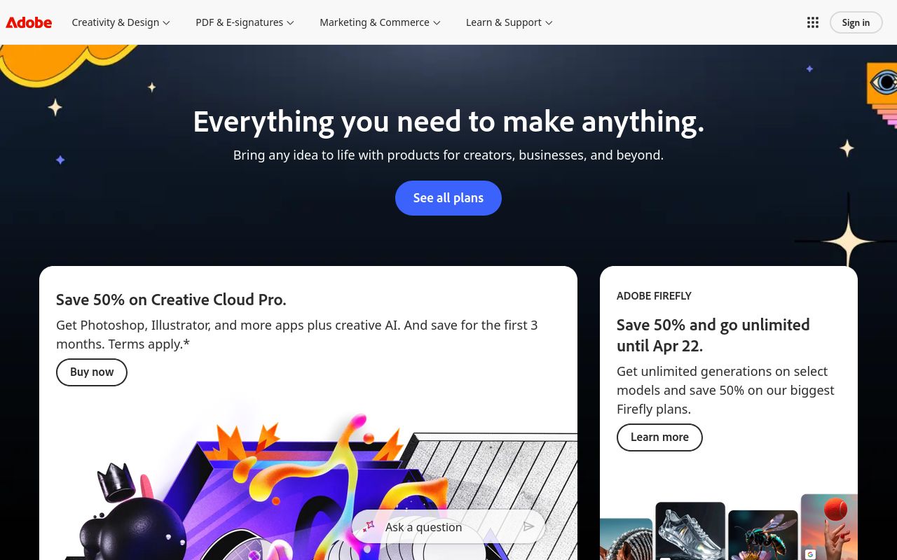
The hero text reads: "Everything you need to make anything.". Lacks action verbs. The hero does not describe what the product actually does, just makes a vague claim. The language is generic — a visitor can't tell what the product does from the headline alone. With a clarity score of 52, Adobe is above the overall median of 36.
The page has 2 CTAs, 2 of them above the fold. That's a focused set, which avoids overwhelming visitors. The primary CTA "Buy now" is generic — 'Learn more' and 'Get started' don't tell visitors what happens next.
Audience targeting is decent — there are audience signals, but room to be more specific. Detected audience: creator. Role words found: "creator". The site uses a "for [X]" pattern: "creators". ICP clarity score: 45 (above the median of 35).
Adobe fits the "Platform / Ecosystem" archetype with moderate confidence. This means the homepage is positioning as a platform others build on — emphasizing integrations, extensibility, and ecosystem over a single feature.
On the pricing page: Adobe has an annual billing toggle. 4 pricing tiers is a solid structure. Show actual prices on your pricing page. Hidden pricing creates friction and drives visitors away.
Even at a B grade, there's room to improve. The copy uses overused buzzwords ("solutions", "solution") that dilute the message. CTA effectiveness is below median — consider using action-oriented language ("Start free trial") over generic buttons ("Learn more").
Hero Text

"Everything you need to make anything."
Word count
6 words
Specificity
generic
Lacks action verbs. The hero does not describe what the product actually does, just makes a vague claim.
Subhead
"Save {{ccp-intro-offer-percentage}} on Creative Cloud Pro."
Calls to Action (2 found)

Positioning: Platform / Ecosystem
The homepage positions the product as a platform others build on. The messaging emphasizes integrations, extensibility, APIs, and ecosystem, not a single feature. This archetype works when the product genuinely connects to other tools, but can feel hollow when applied to simple single-purpose products.
Audience Targeting
Specificity
decent
Detected audience
creator
"For X" pattern
"creators"
Recommendations
- You mention roles but not company types. Adding 'at [company type]' helps narrow the ICP further. 'For marketers at B2B SaaS companies' is much sharper than just 'for marketers.'
First Impression
A visitor would think this is a e-commerce / dtc for hr that offers app that manages.
Pricing Page
Tiers
4
Free tier
No
Score
75/100
- Show actual prices on your pricing page. Hidden pricing creates friction and drives visitors away.
- Consider adding a free tier or free trial. It reduces friction and lets prospects experience your product before paying.
- Add a FAQ section to your pricing page. It addresses objections and reduces support load.
- Add social proof to your pricing page. Logos, testimonials, or customer counts reassure buyers at the decision point.
- Add a feature comparison table. It helps visitors understand the differences between tiers at a glance.
Compare Adobe
Get the same analysis for your site
Grade Your HomepageWant a team to help fix this?
Work with us